Adpative mesh WiFi router serviceCompetitors: Google WiFi, Orbi, Eero
My role:
Support, Community and Webstore Design
Learn More:
https://plume.com/
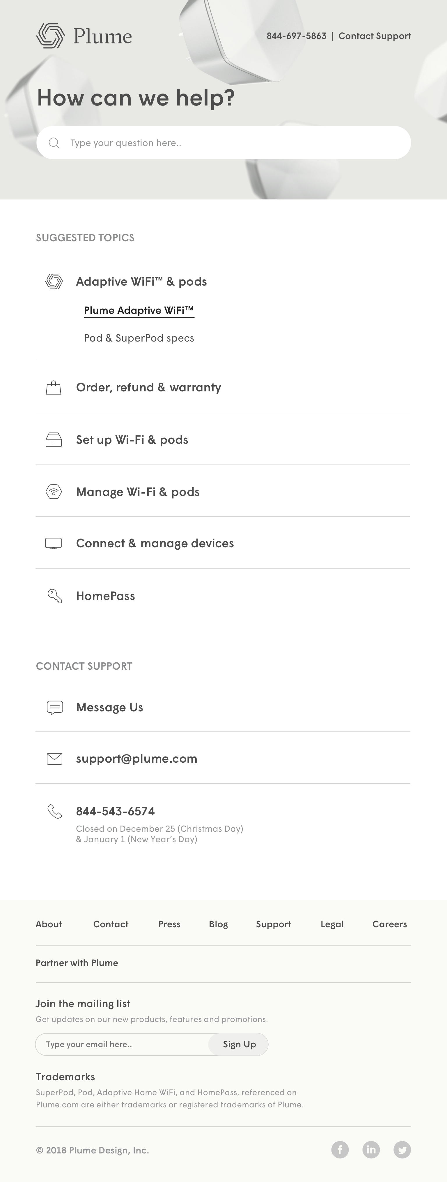
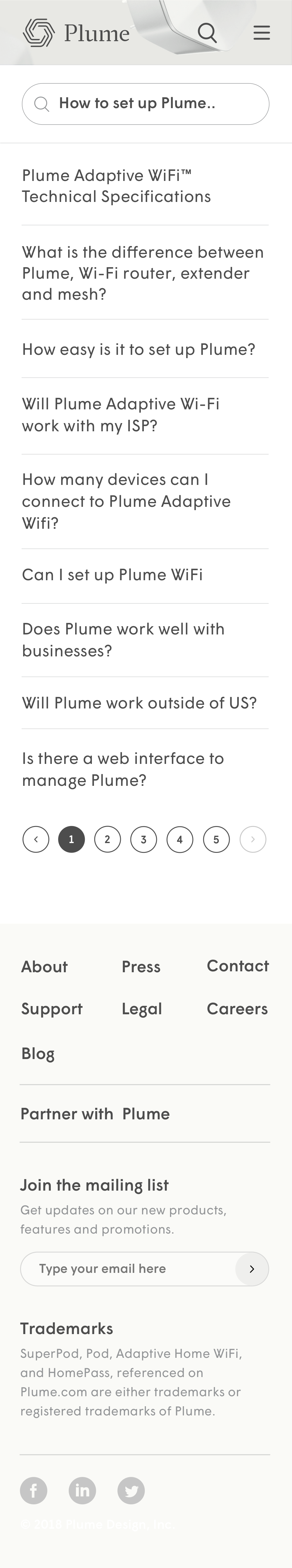
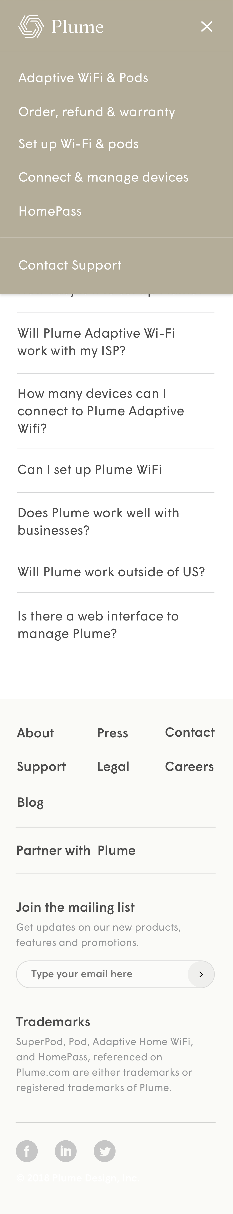
Support Design
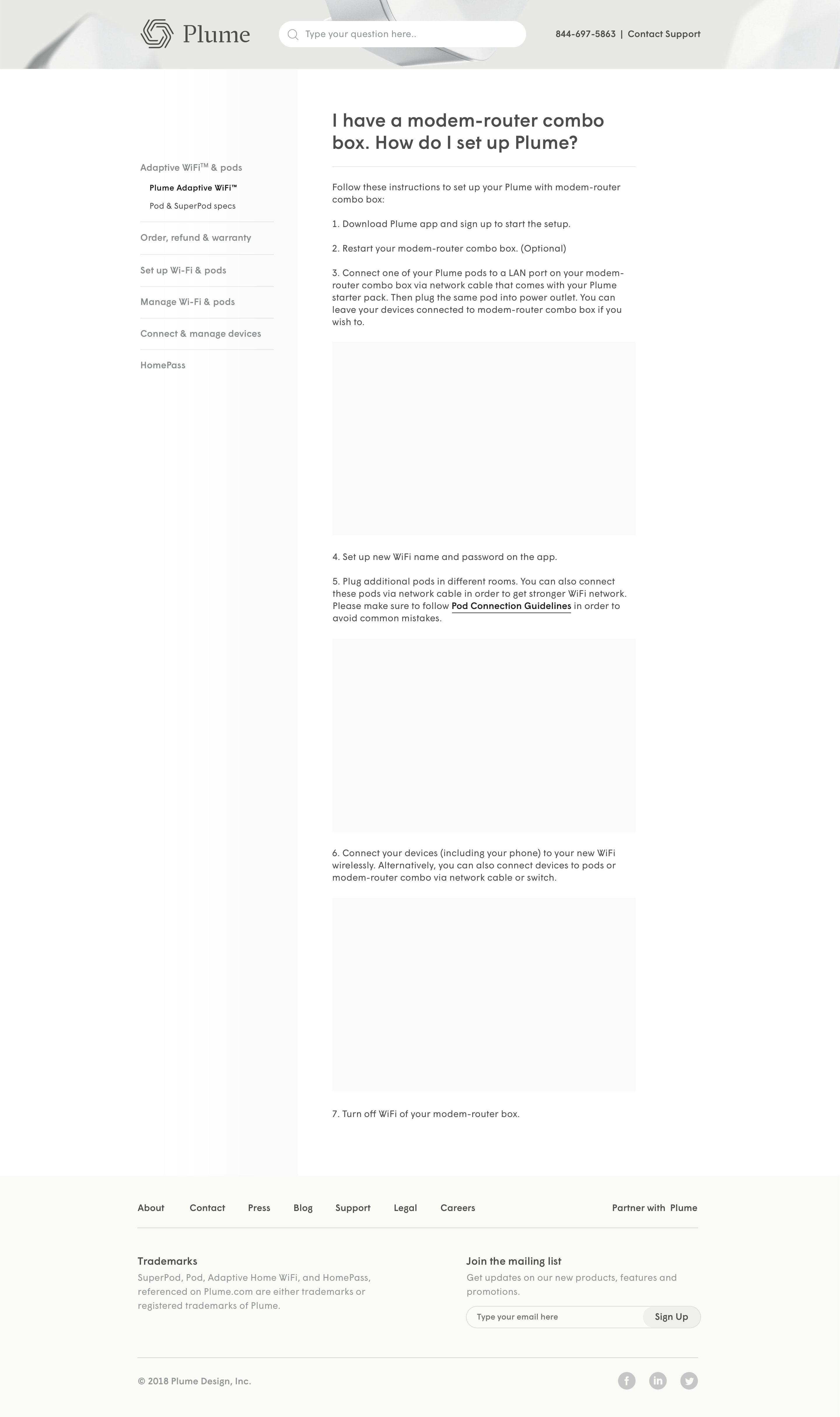
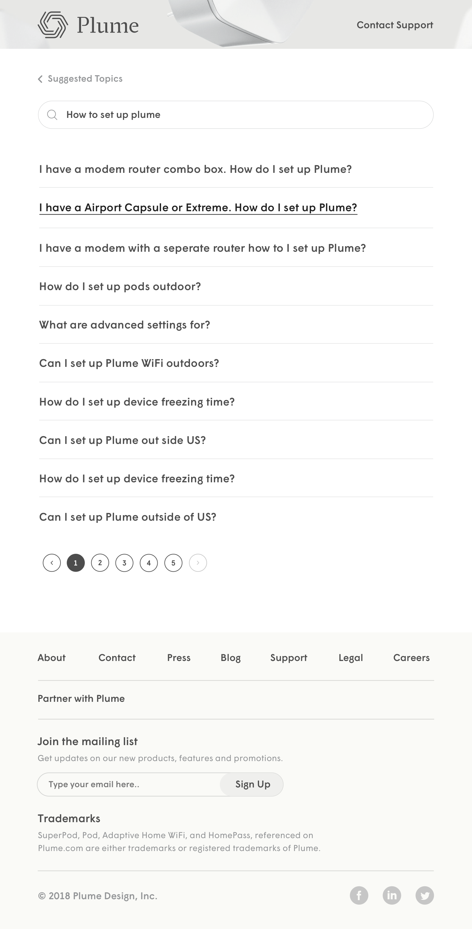
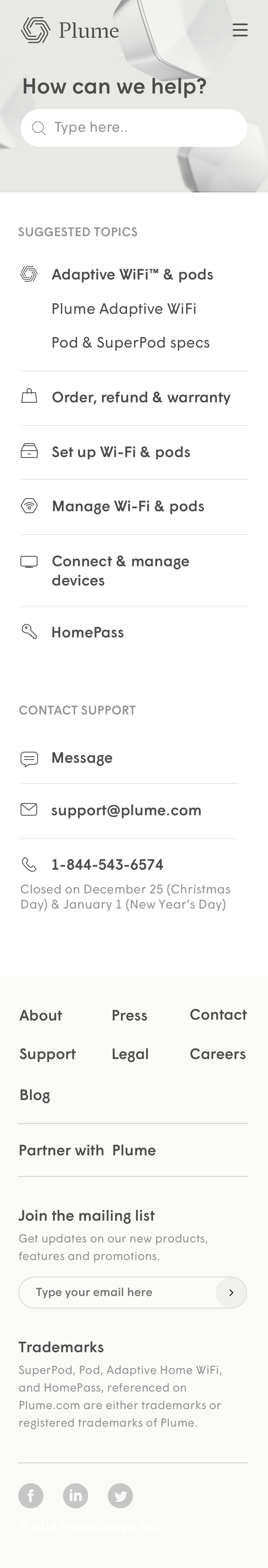
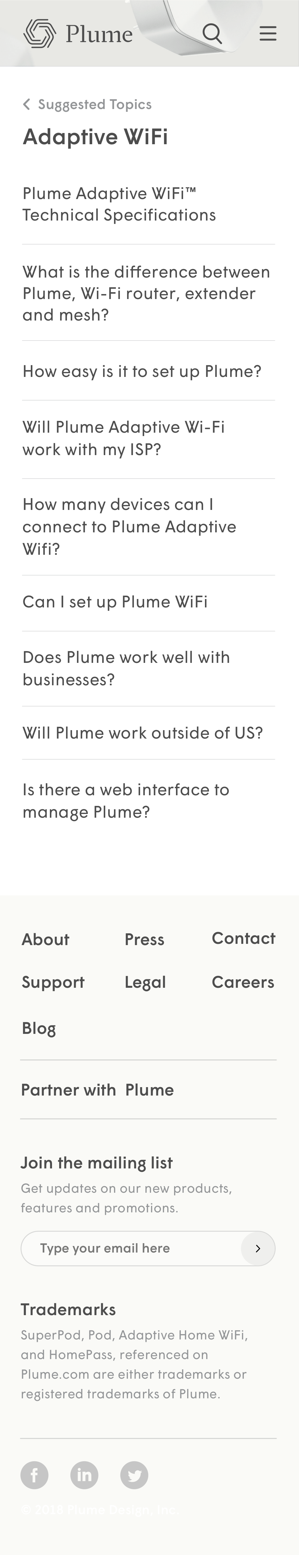
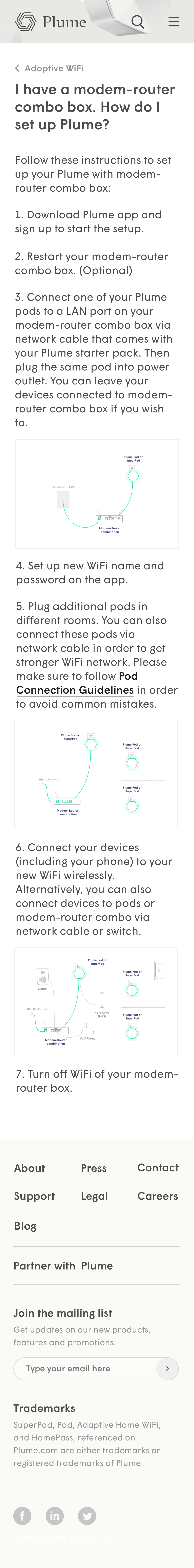
When I started on Plume's Support Website (support.plume.com), it was built on zendesk with one of the templates. I redesigned the whole support website to make it more user friendly.
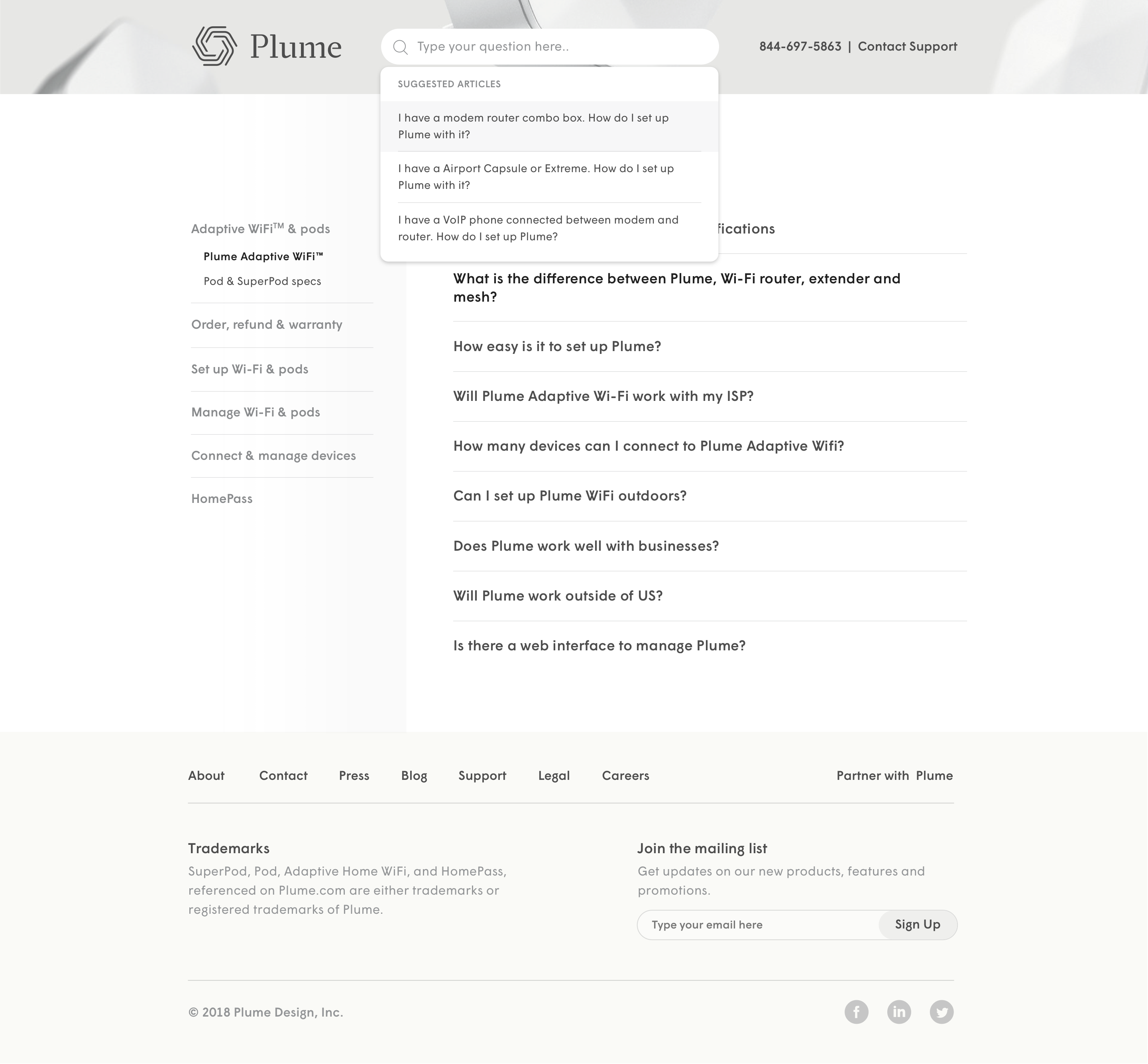
FINDING BEST PRACTICES
As a first step, I analysed support/Help-center websites for Gusto, Airbnb, Uber, Clerky, Hellosign and many more to find out best practices. Airbnb, Gusto and Clerky are phenomenal examples for information architecture, content and visual design. Uber is the best example for in-app help. Google's search is best, ofcourse. I ended up not liking Hellosign as much. I learn from bad examples as much as from good ones.
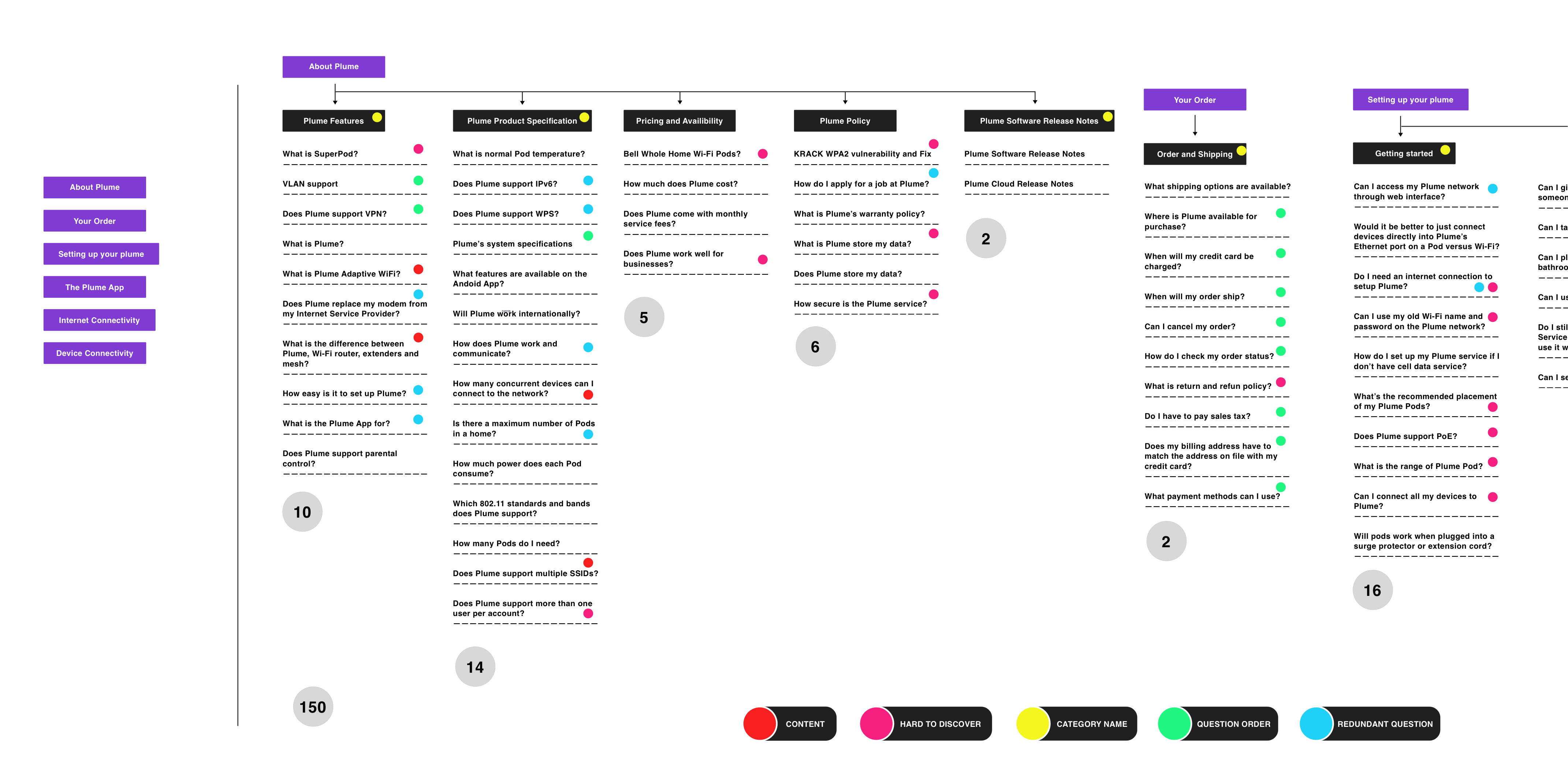
INFORMATION ARCHITECTURE & USER PAIN POINTS
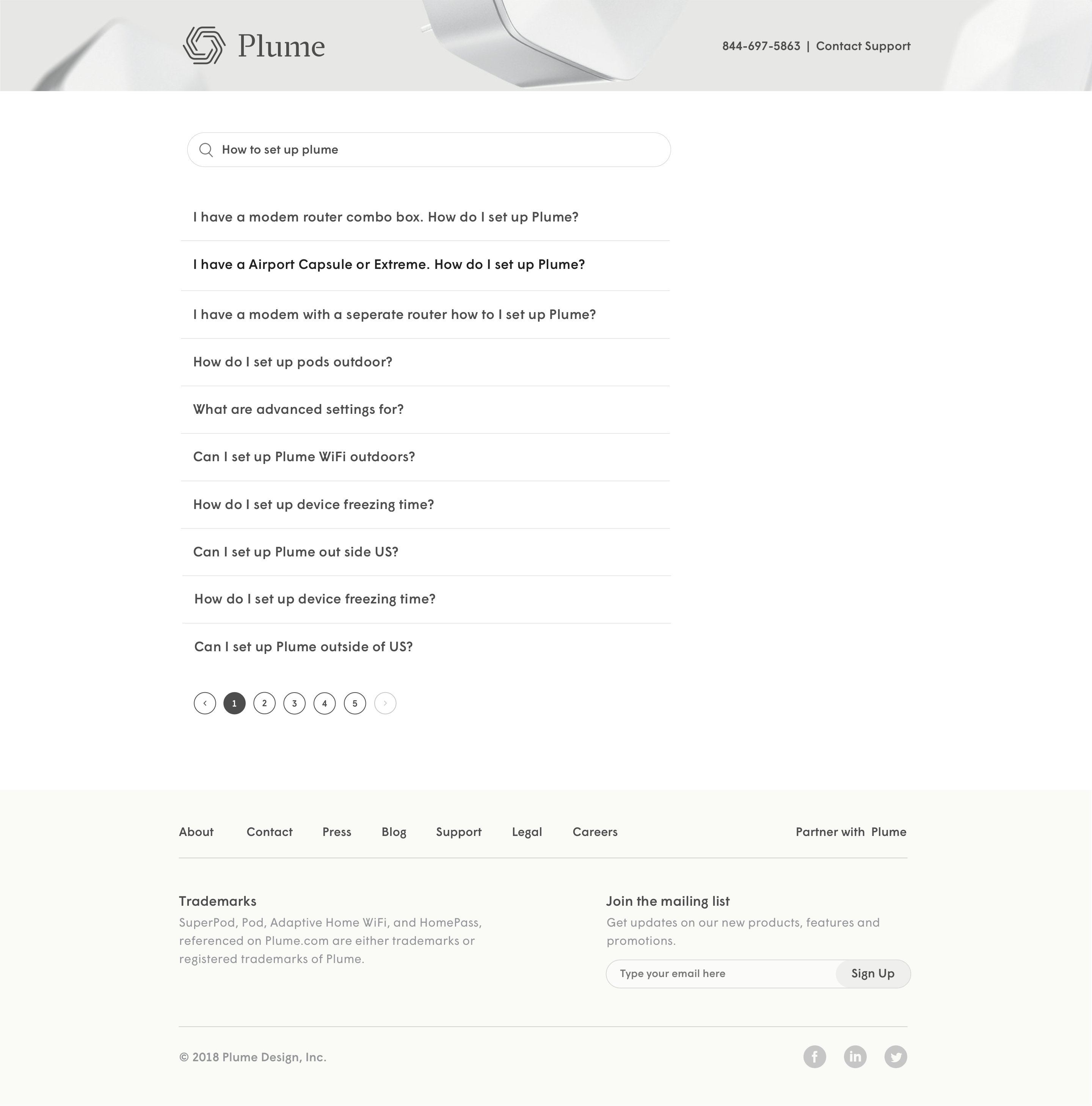
Simultaneously analysed current information architecture. Found out following problems:
1. Too many questions (Around 150).
2. Categorization and category titles were not intuitive.
3. Many questions were placed under a wrong category. Hence, hard for user to discover questions.
3. Many redundant questions.
4. Content was not concise, user friendly, accurate or had needed visuals/diagrams.
5. The order of questions was not correct under many categories.
6. Search was not functioning properly.
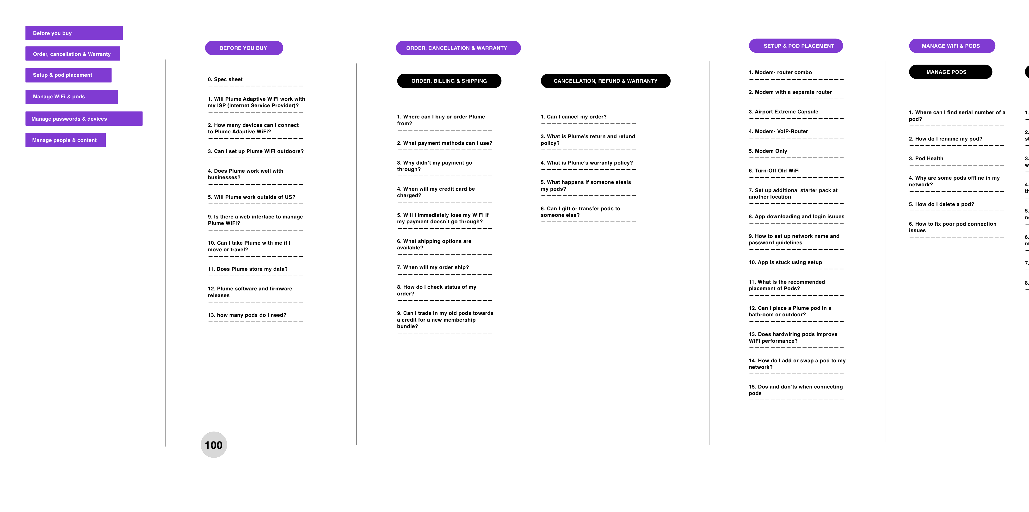
Redesigned architecture with intuitive categorization, question placement, and revised content. Wrote 100+pages of technical content. Uploading more content work soon.
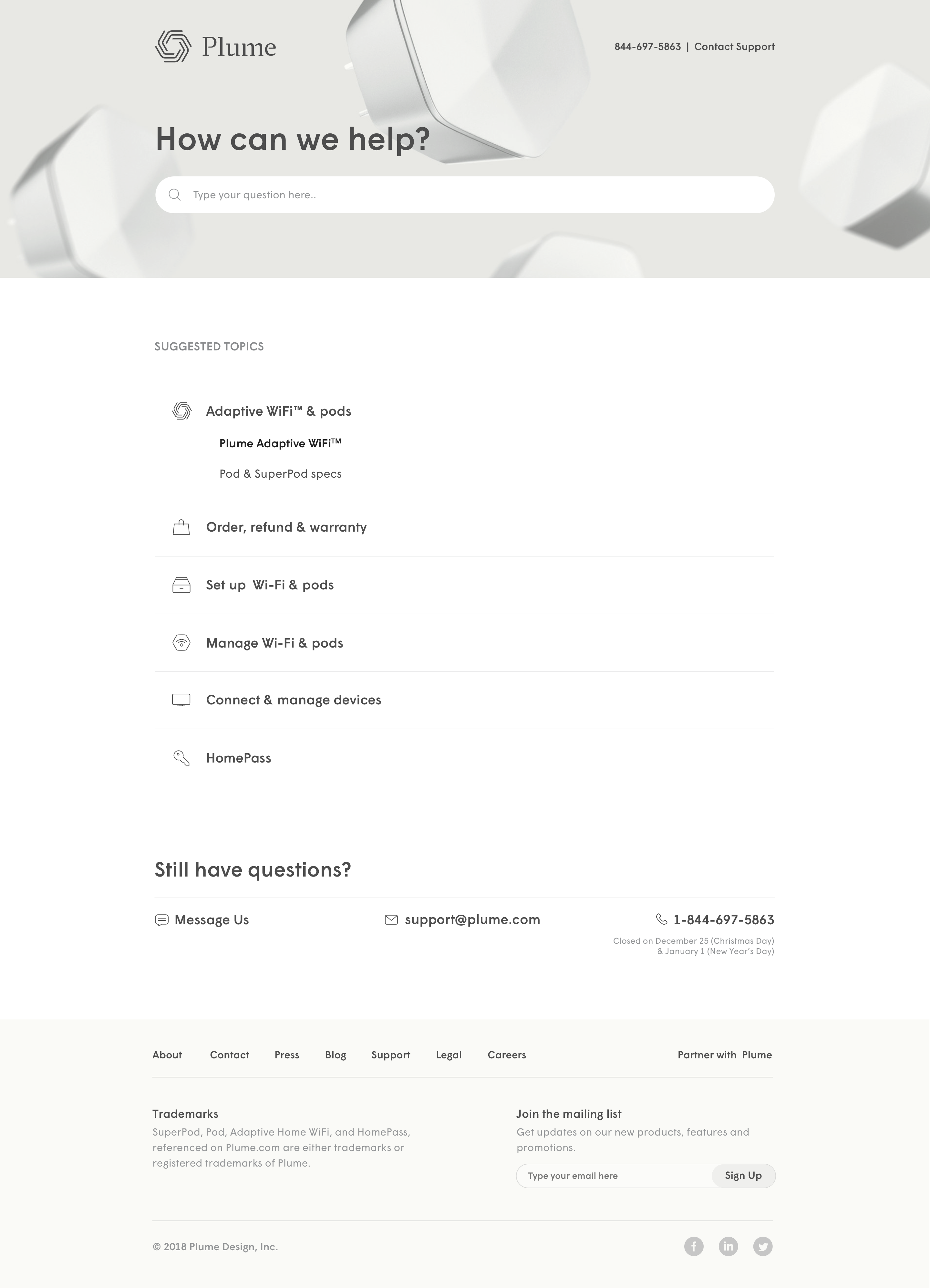
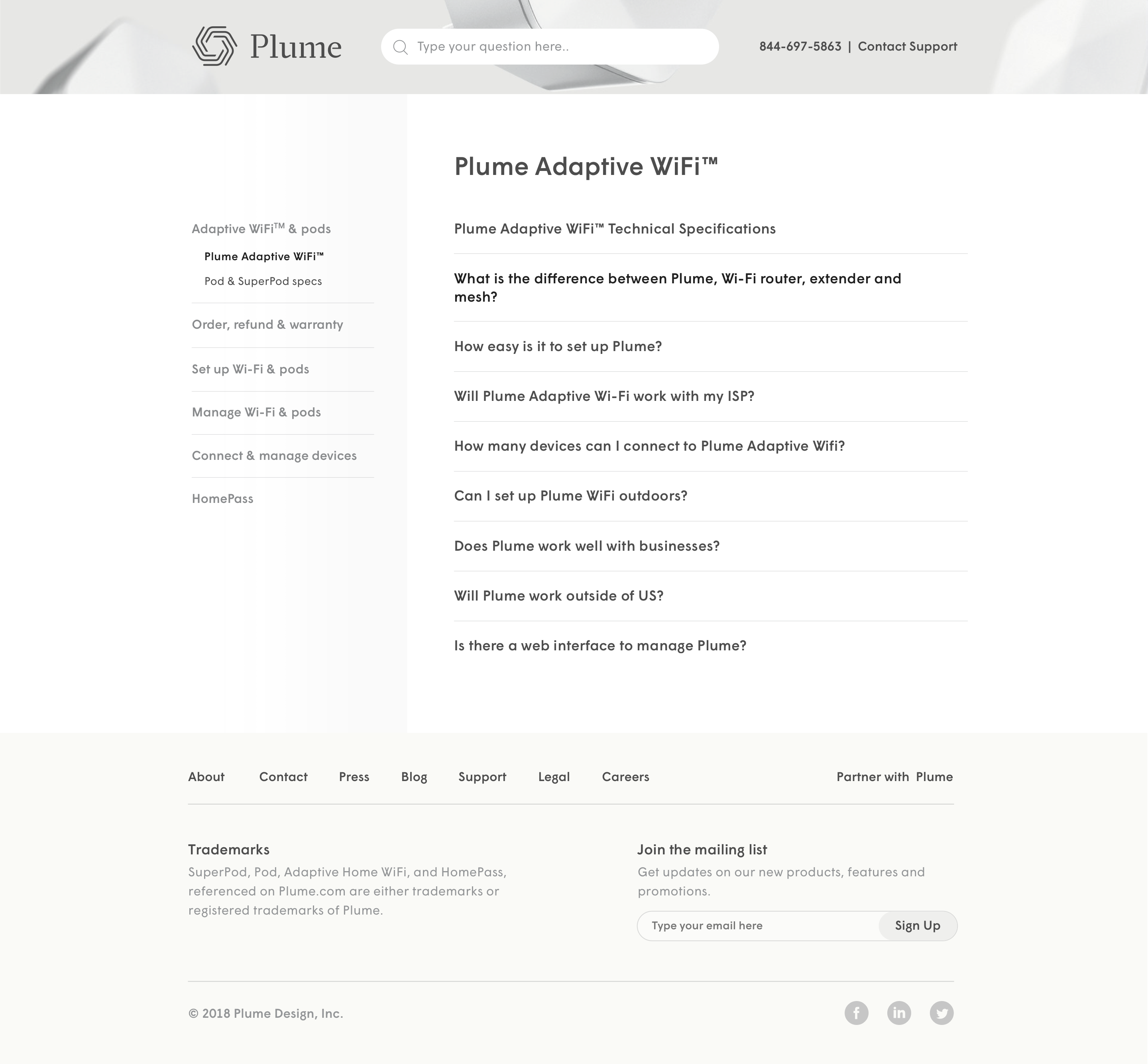
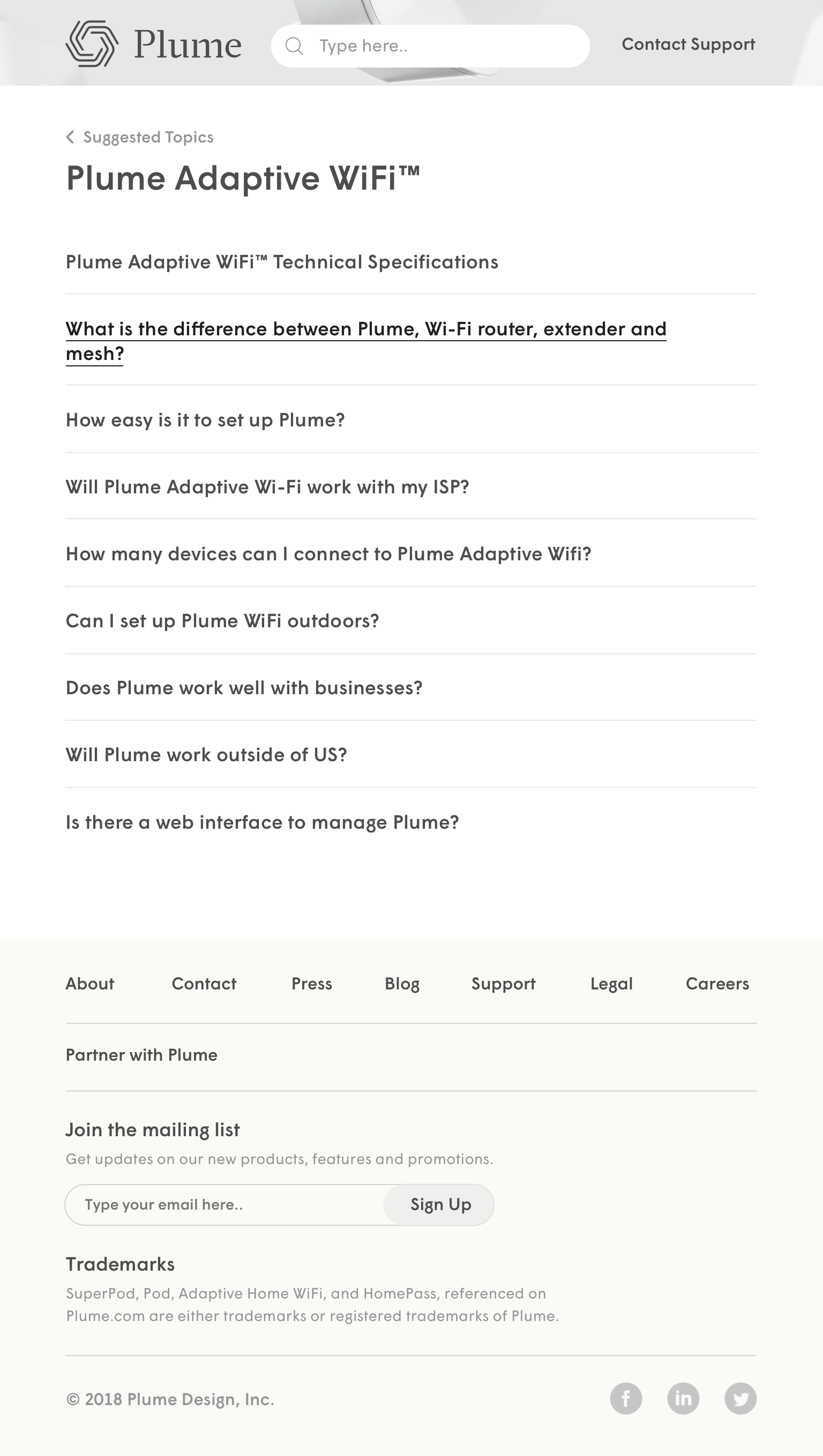
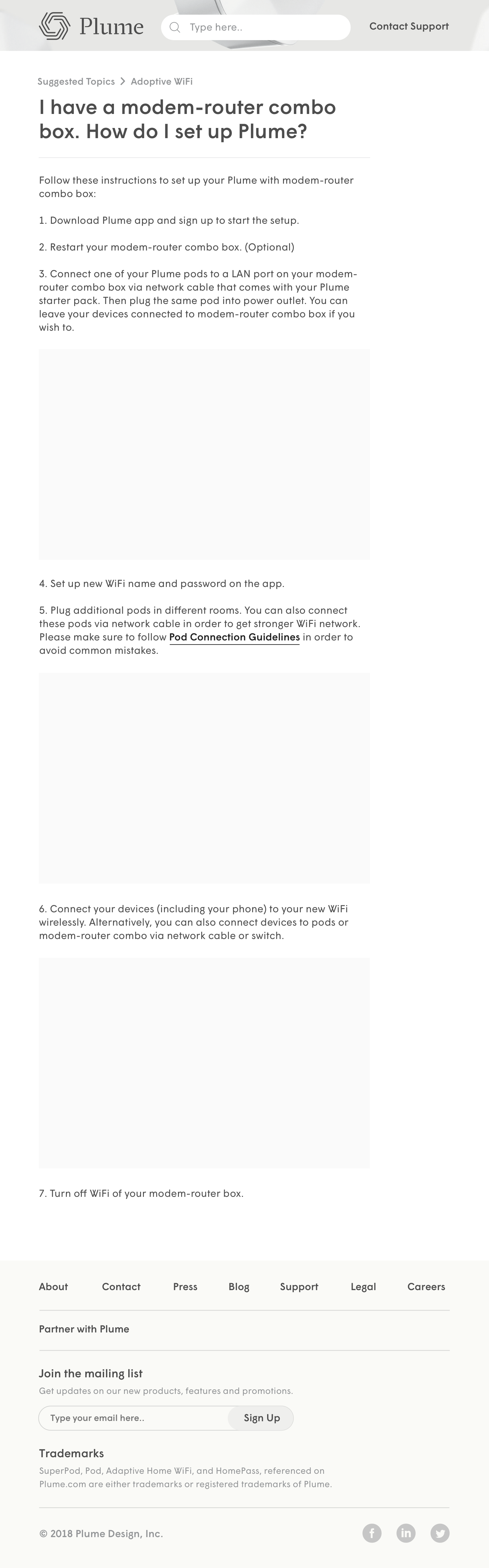
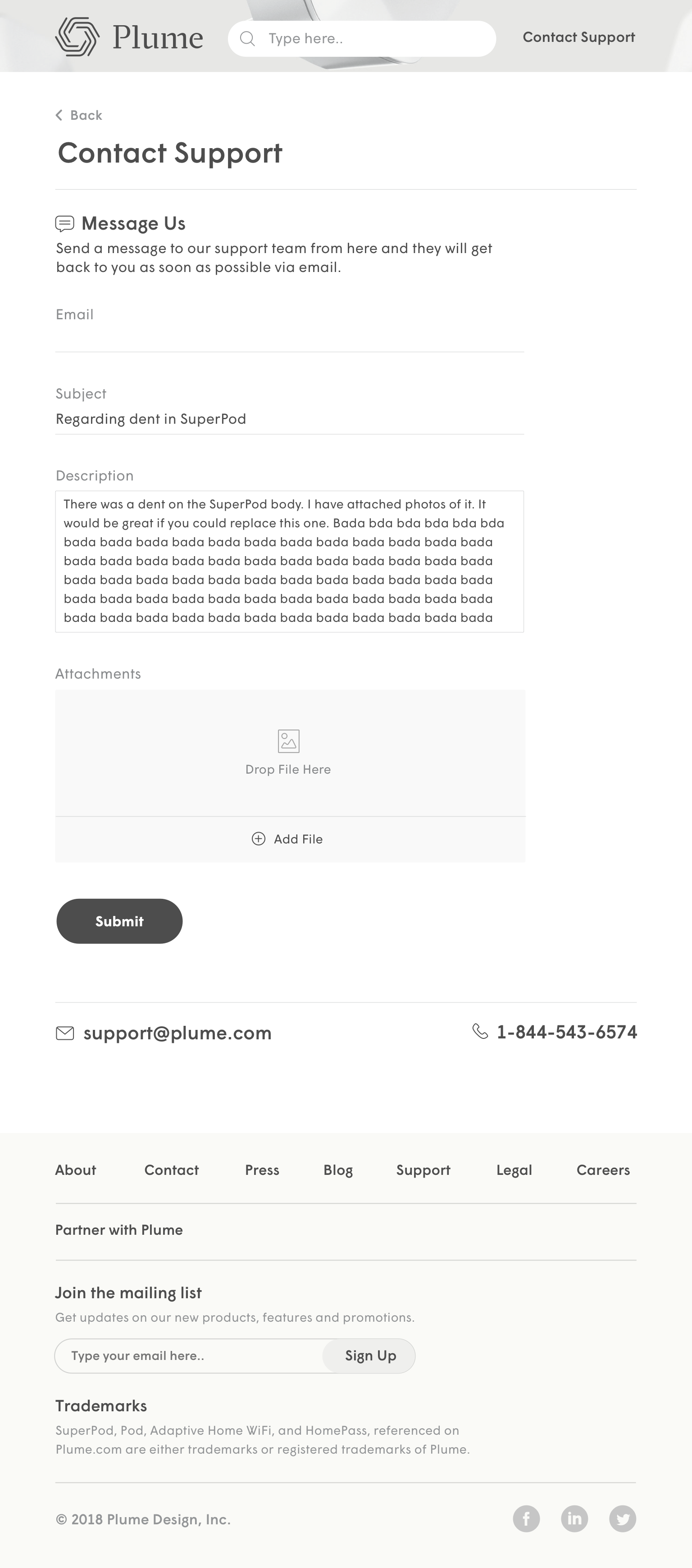
UI REDESIGN-WEB
<
UI REDESIGN-TABLET
UI REDESIGN-MOBILE
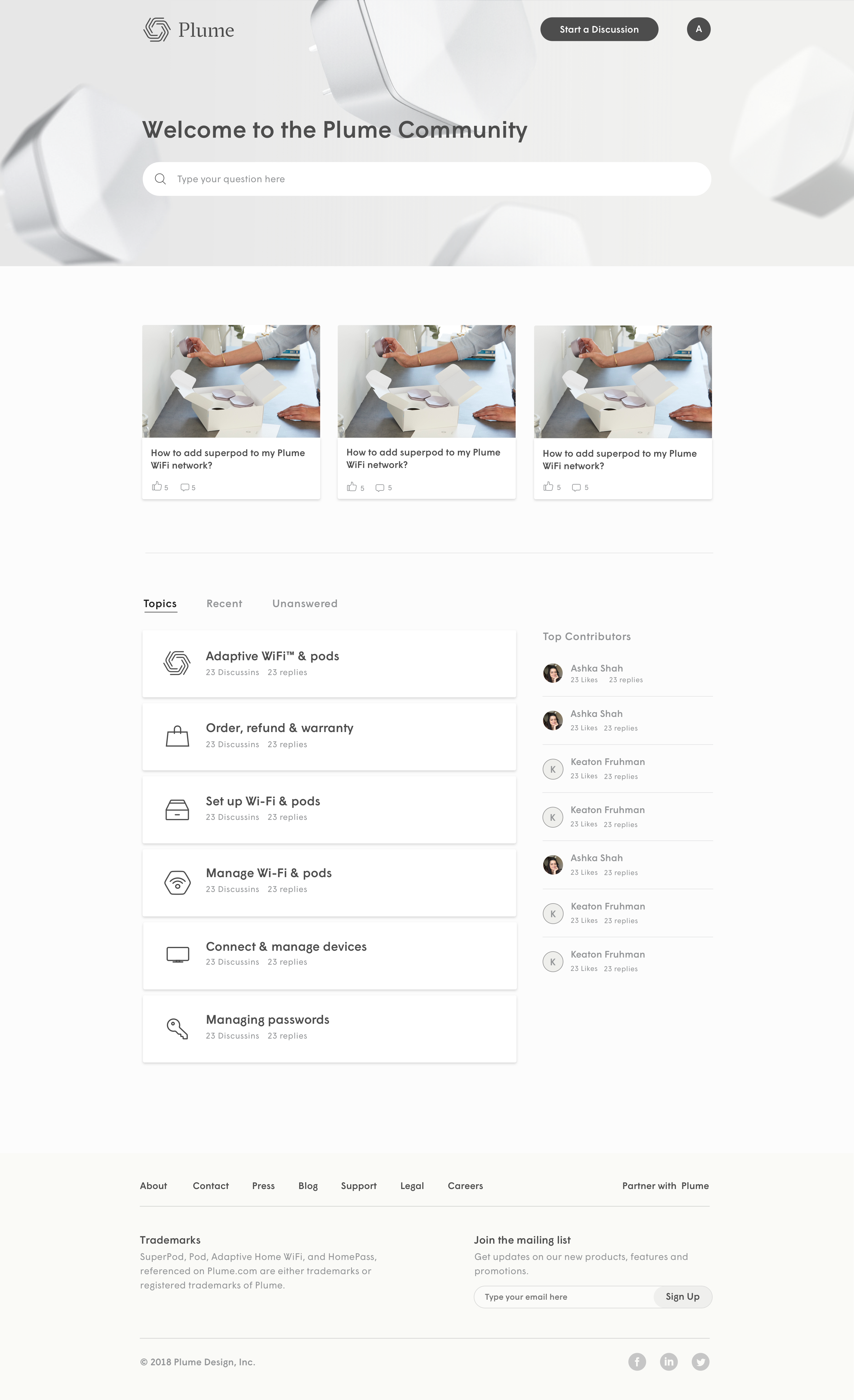
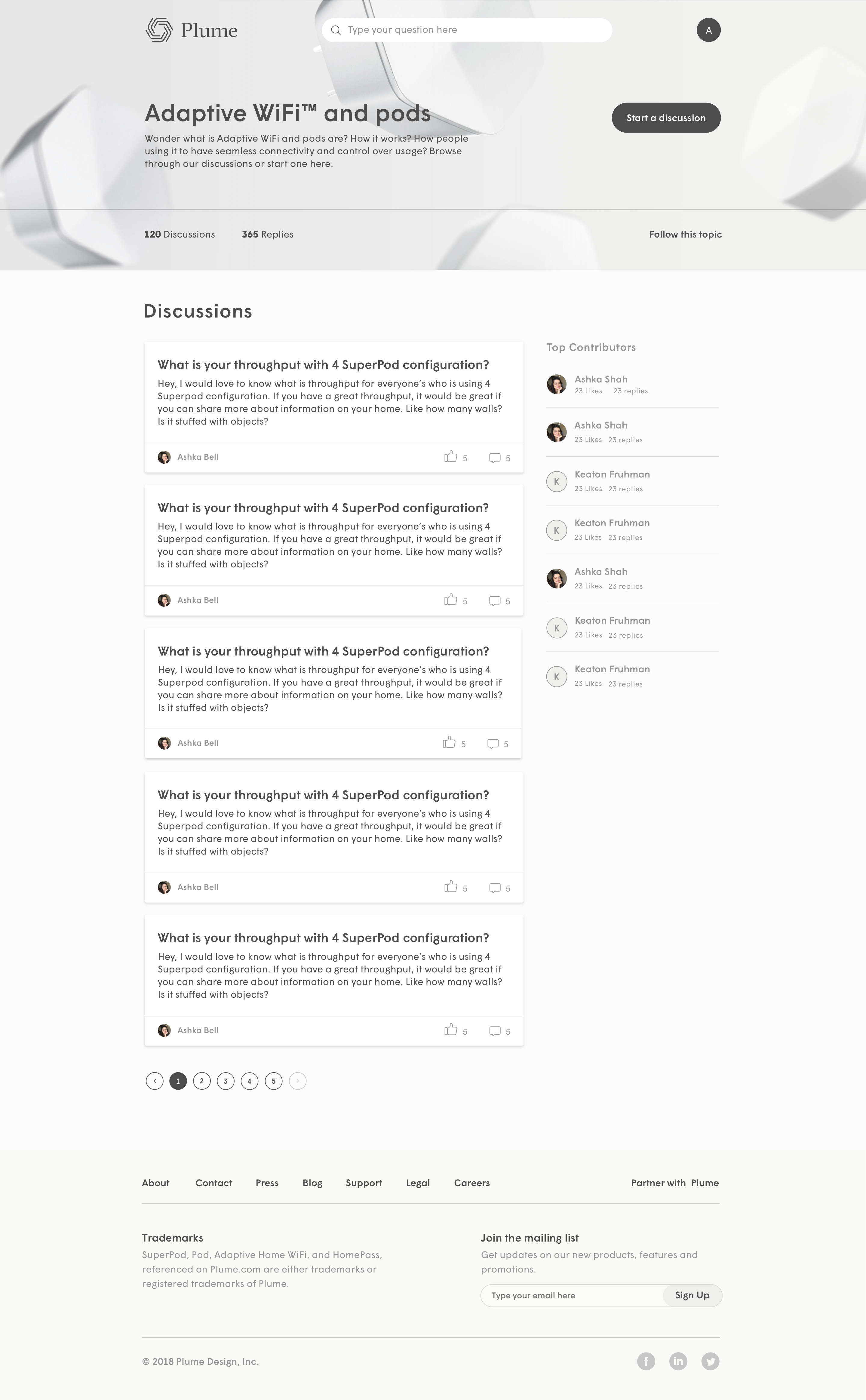
Community Design
I designed the community website built on insided. We started off with Beta community and then were planning to open up to all the users. We were transitioning beta users from facebook page to this community website. Also, translated these designs into Insided styleguide settings.
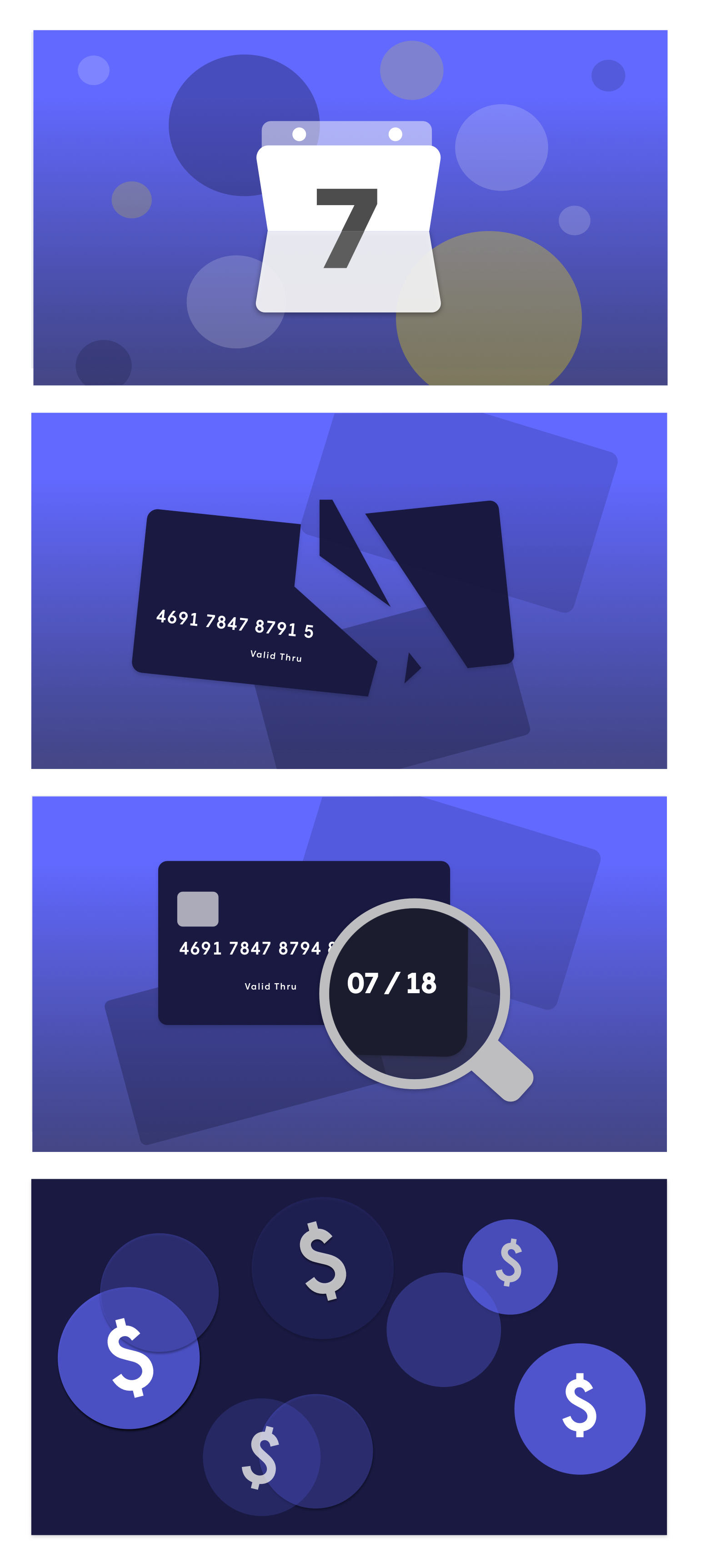
Webstore Analysis for Converstion Rate Optimization and Redesign
Plume started selling SuperPods last year. In order to optimize conversion, I analysed existing website and then proposed a redesign. Here is the proposal:
ANALYSIS OF CURRENT WEBSITE
Current website does not have intuitive information architecture. The inforamtion is also not meeting user needs/flow. Website contains a lot of redundant and incorrect information. Moreover, it does not allow users to easily compare starter packs and packs with competitors's bundle. All of these is leading to churn and hence the need for redesign.
SETTING UP TRACKING AND ANALYTICS
I along with marketing person set VWO analytics to obeserve user behavior on current website. We also nailed down metrics, how to perform A/B test, track heatmaps and so on.
VALUE PROP AND PRICING
I studied other competitors, their pricing and how Plume pack would stand out for different user segments. Also, proposed pricing models that could be more user friendly and would drive purchasing behavior.