CrowdMed(Y Comb.'13)
A website crowdsourcing medical diagnoses and treatment solutions for patients with unresolved medical conitions
My Role:
Lead UX Designer (Nov'15-Oct'16)
Designed a Free Trial Servicethat Doubled Case Submissions(User Acquisition by Design Thinking)
Crowdmed tried offering free trial to the customers in the past, but it failed at acquiring paid cases.
I re-designed a free trial service which doubled the paid case submissions. This tought me how design thinking along with sales strategies is crucial for user acquision. Here is how I designed this service:
1. LOOKED AT EXISTING EXAMPLES FOR FREE TRIAL SERVICES
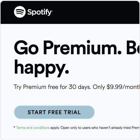
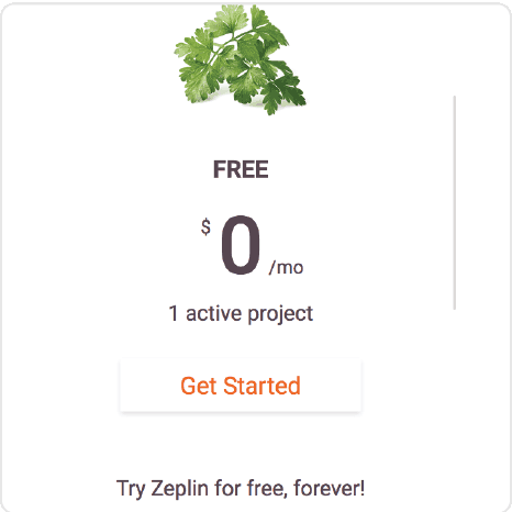
I looked at how free trial is designed at Netflix, Spotify, Coursera, Zeplin and many more platforms.
I derived that following design patterns have contributed to the success of free trial on these platforms:
1. Free trial button instead of sign up button
2. Offering a paid package for free for a short period of time
3. Collecting payment information in the sign up process for free trial
4. Automatic enrollment into paid package after free trial period is over
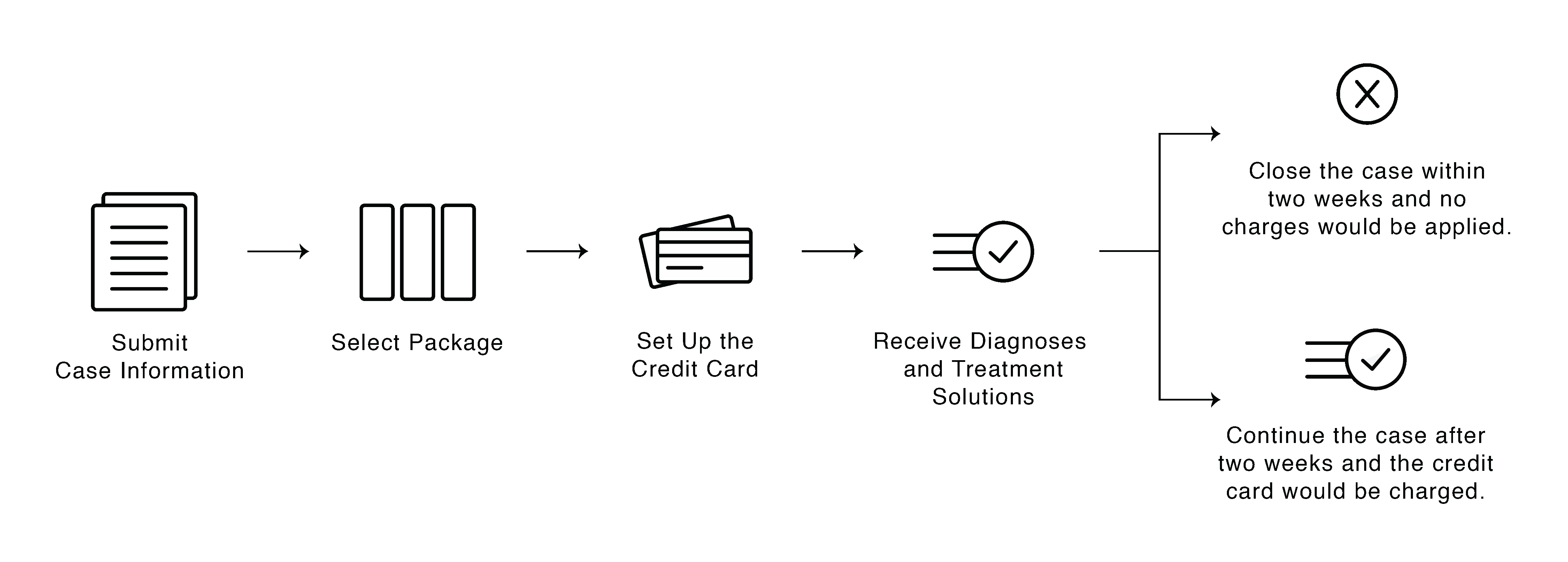
2. DESIGNED USER FLOW OF FREE TRIAL SERVICE FOR CROWDMED
CrowdMed had not collected payment information and setup automatic enrollment the first time.
I added both in the new free trial service and came up with the user flow as shown below. We decided offer free trial for two weeks to start with
and adjust the duration later if required.
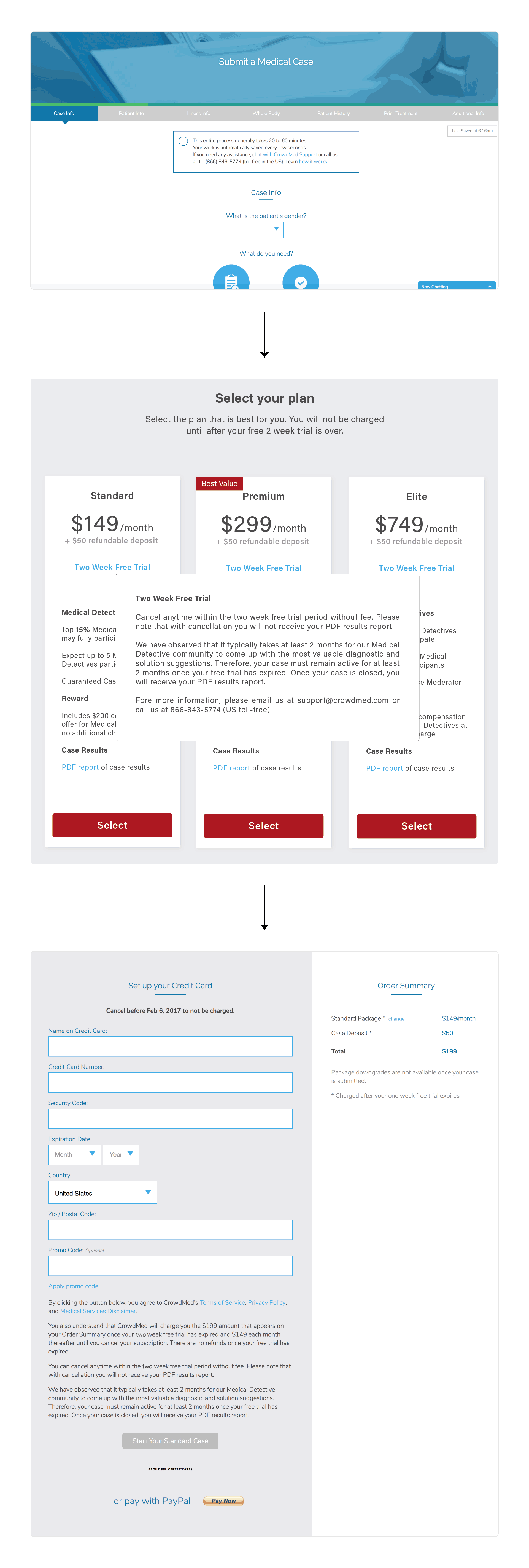
3. TWEAKED PATIENT SIDE INTERFACE TO INTRODUCE NEW FREE TRIAL SERVICE
4. TWEAKED MEDICAL DETECTIVE SIDE INTERFACE TO INTRODUCE NEW FREE TRIAL SERVICE
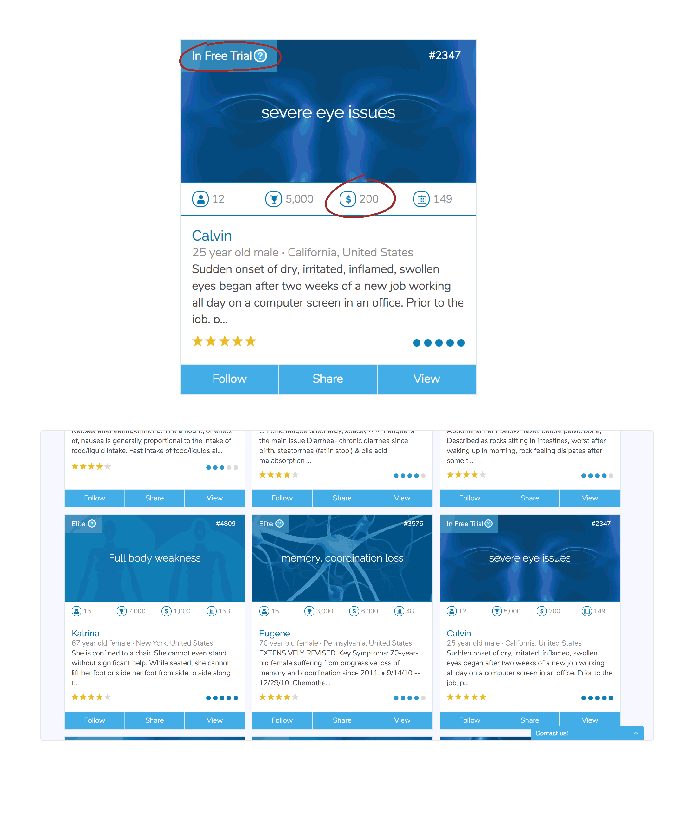
CrowdMed had displayed "0" as reward amount for the cases under free trial the first time. This did not motivate medical detectives to participate on cases, because monetary reward is the main incentive for majority of them.
This time I displayed reward amount for the package selected by the patient on the case display card. Also, added a tag of "In Free Trial" for medical detectives to easily identify cases
under free trial.
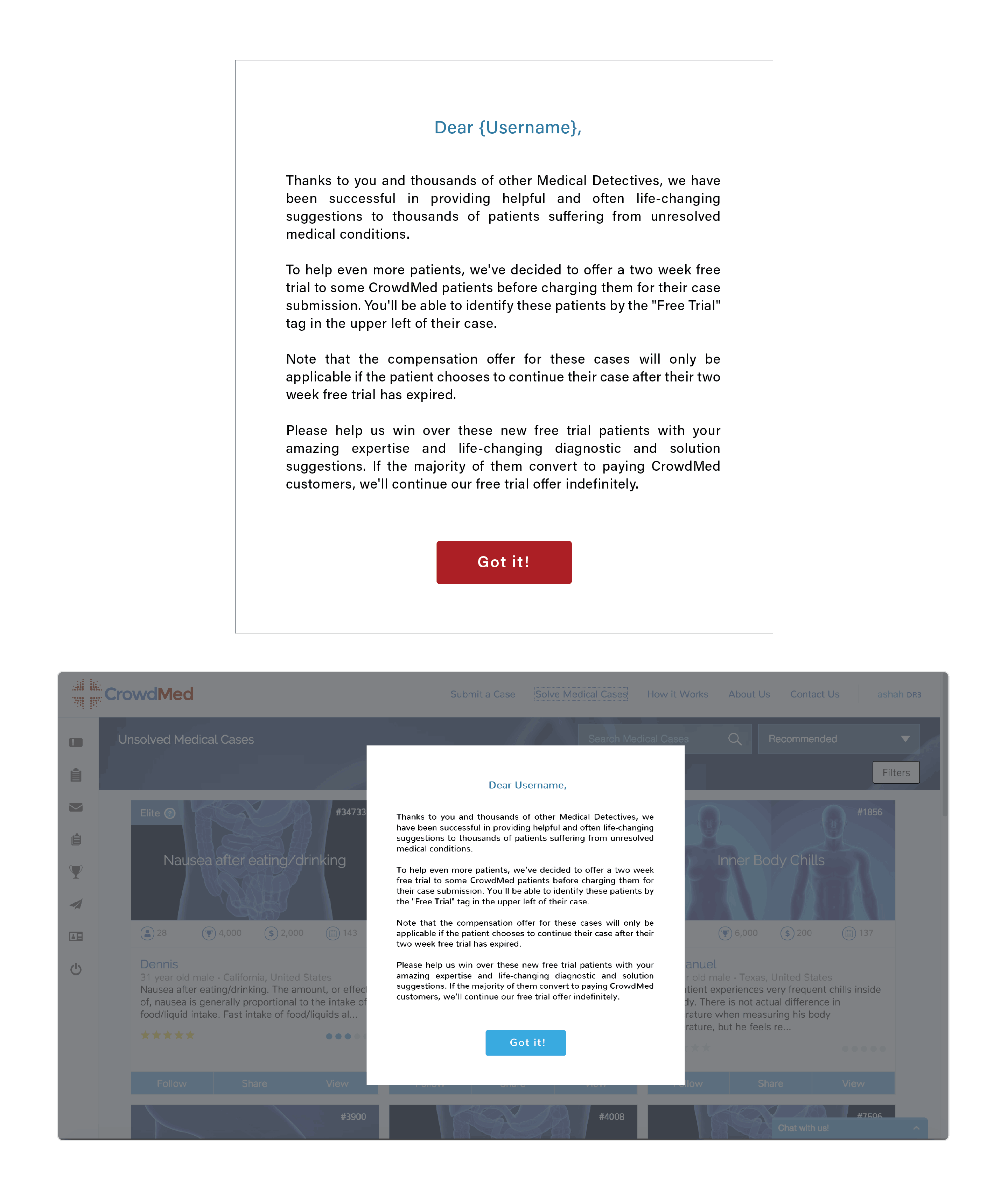
Also, showed a one-time popup introducing free trial service to all the detectives as shown below.
User Interface Re-Design
I started a new development cycle since I started leading UX.
I studied the platform thoroughly and carried a small scale user research to understand UX issues on the platforms.
Based on the insights collected, I laid out strategy for redesigning, i.e. set up an order in which all the pages/features on the site should be redesigned.
1. REDESIGNING CASE PAGE FOR MEDICAL DETECTIVES
The case page is the most frequently used page and it had the most critical UX issues.
Here is a brief documentation of UX issues on this page:
UX Issues with Case Page by Aashka M Shah on Scribd
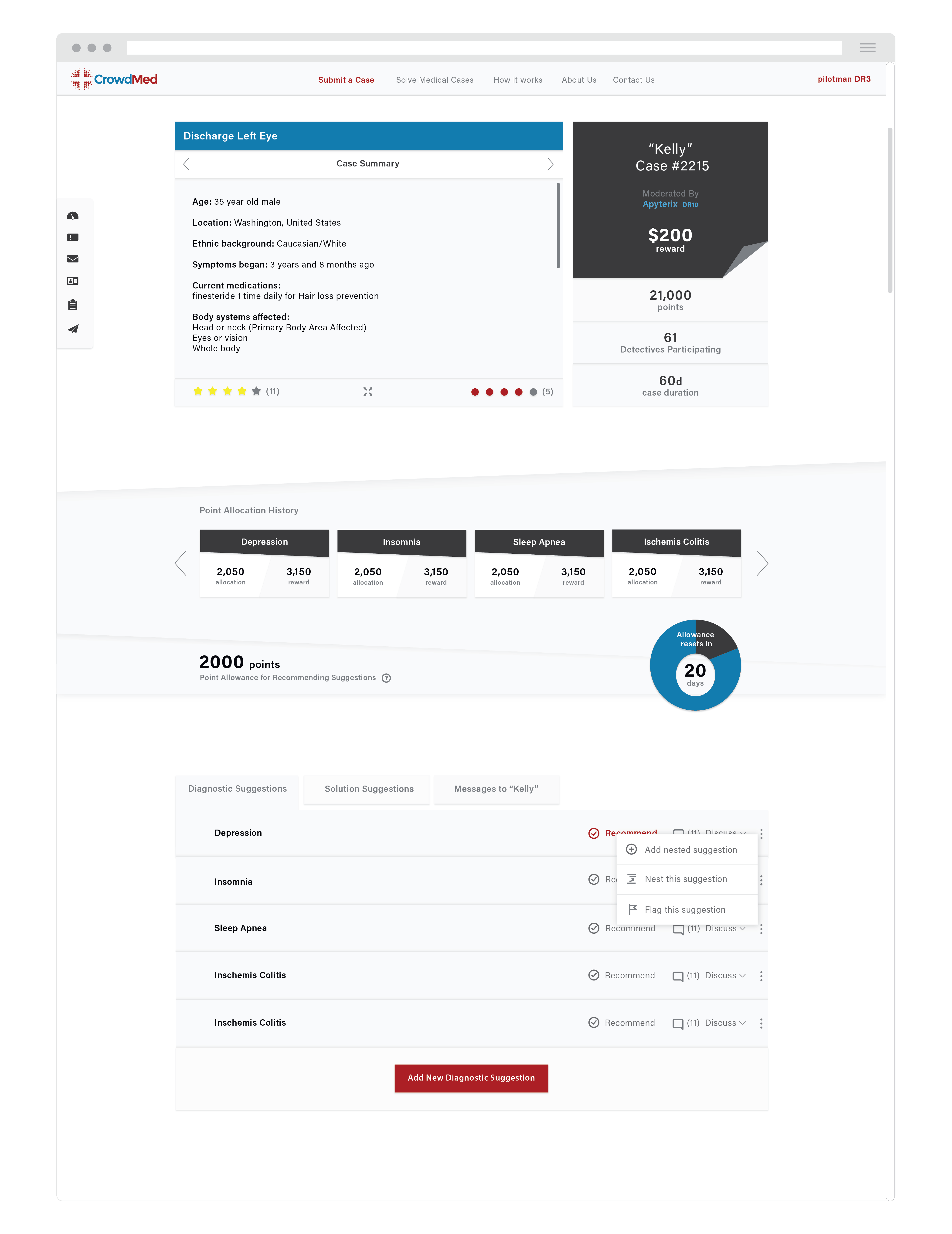
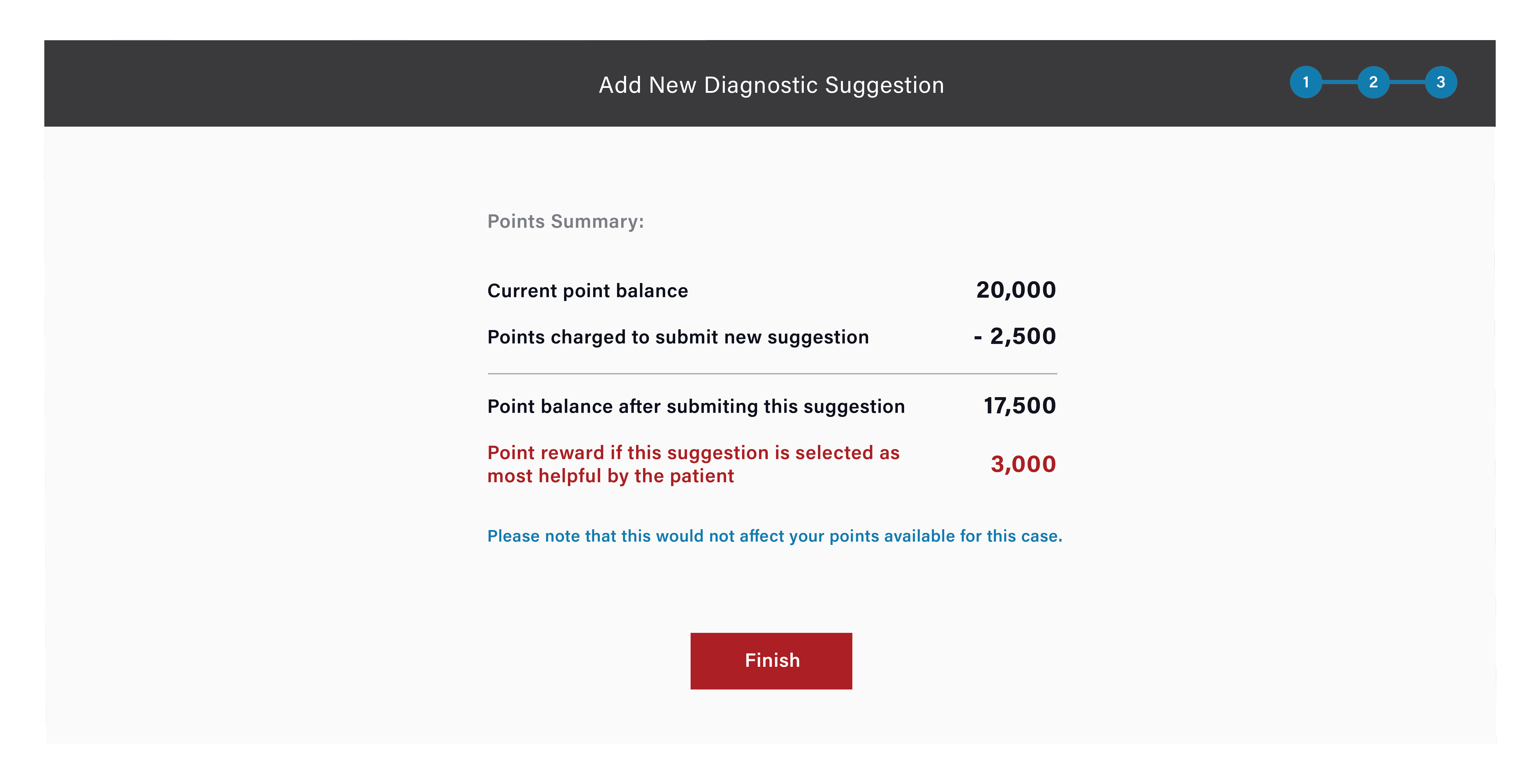
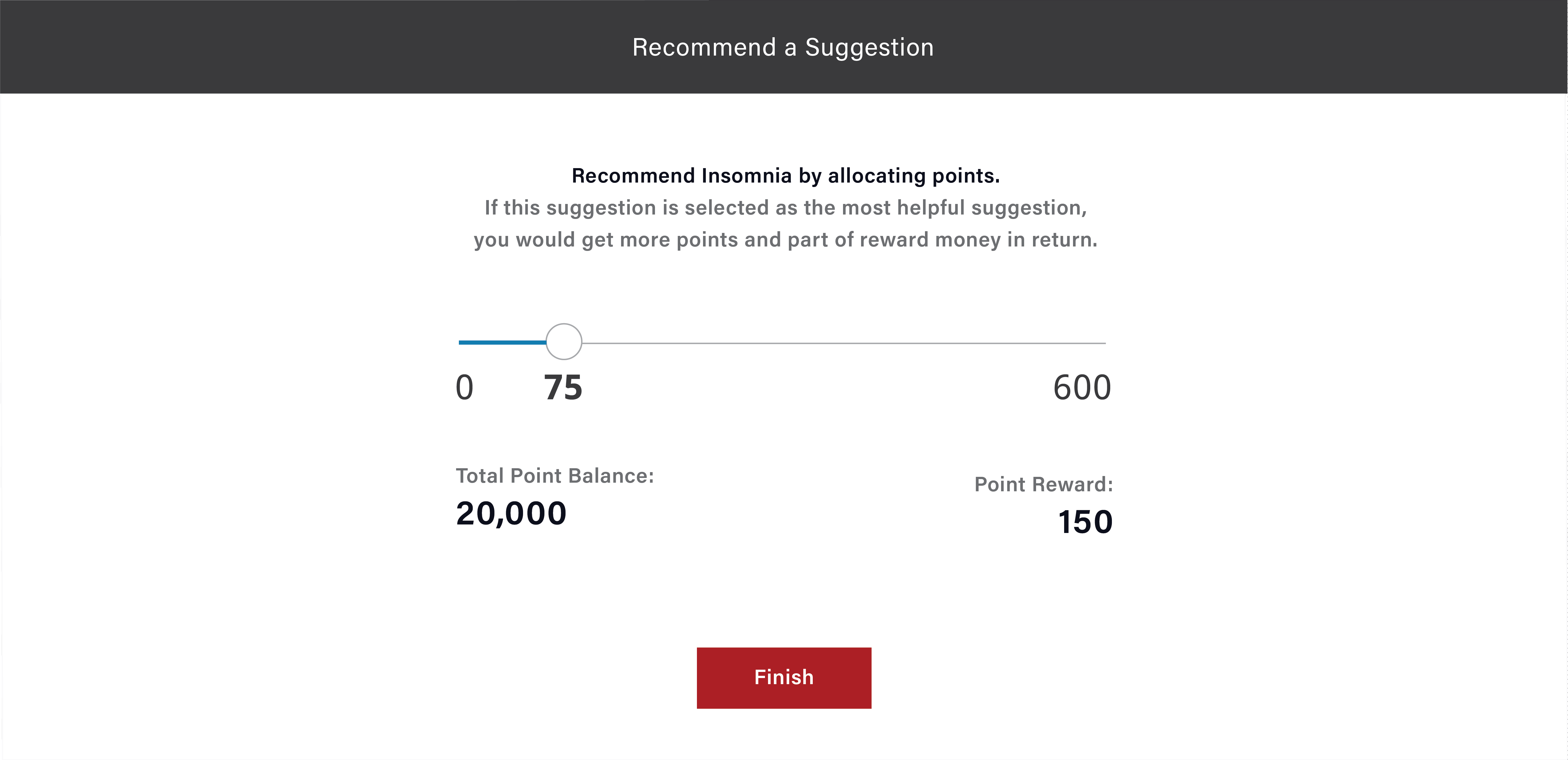
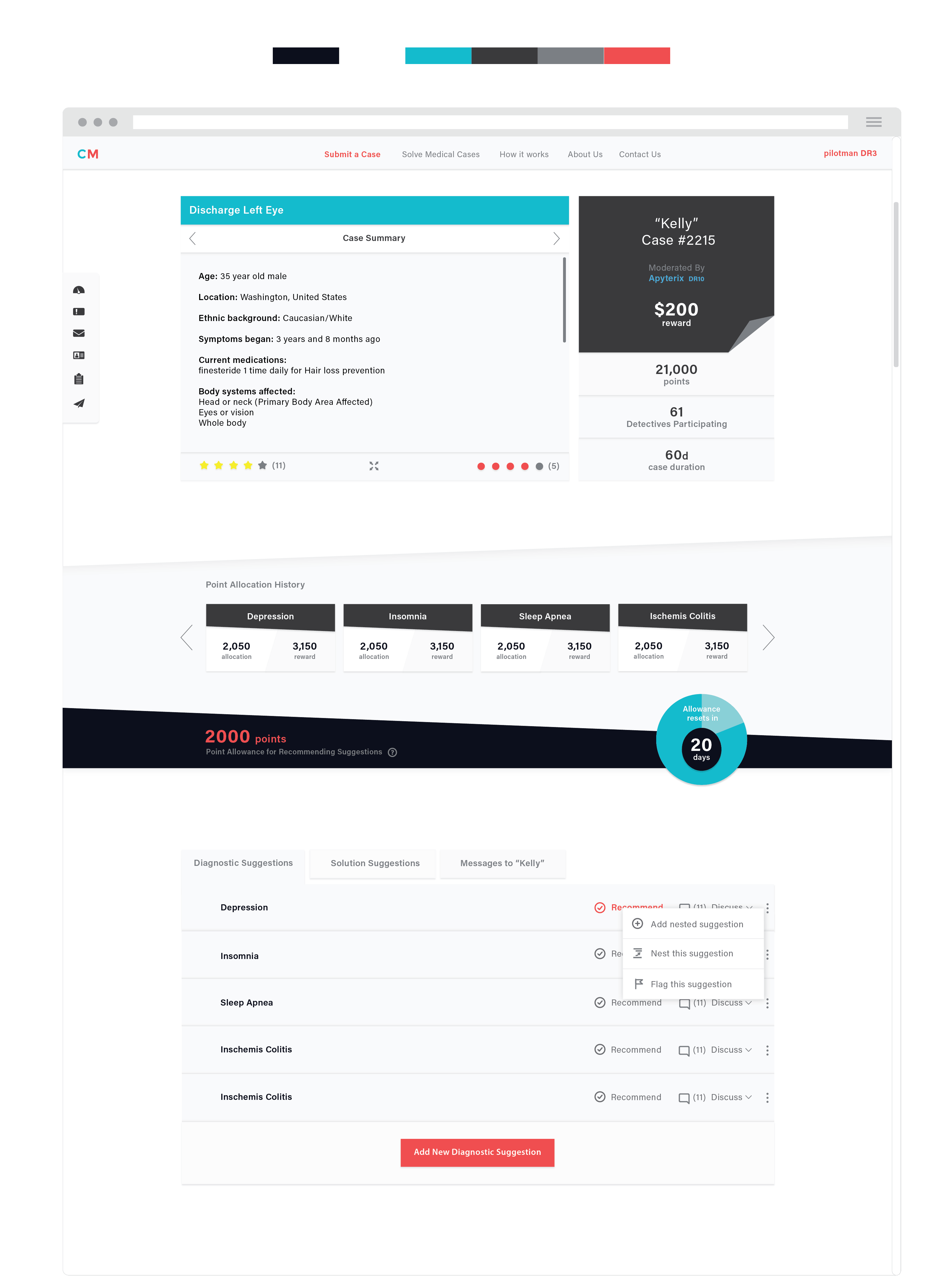
I fixed these UX issues and also introduced a new way of allocating points (recommending a suggestion) along with point allocation history feature.
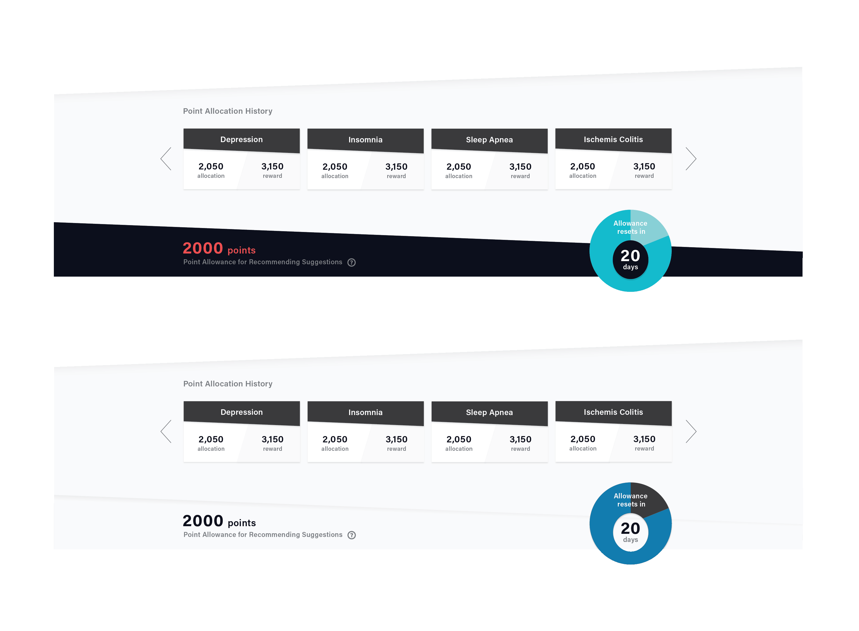
Tweaking Point Allocation: Point allocation (recommending suggetions) is only allowed once a month on any case with a maximum limit set based on detective's rating. This is not allowing detectives to recommend a suggestion at a right time.
This is generating either delayed or premature recommendations on the webiste. In the new design, I am allowing detectives to allocate points any time with a maximum limit each month on each case. This functionality tweak will not just enable timely recommendations but make the interface way more simpler for detectives.
Also, medical detectives participate on an average 20 cases at any given time. It is really hard for them to remember recommendations they have made on each case, so I introduced point allocation history feature on this page.

We also observed redundancy in the suggestions.
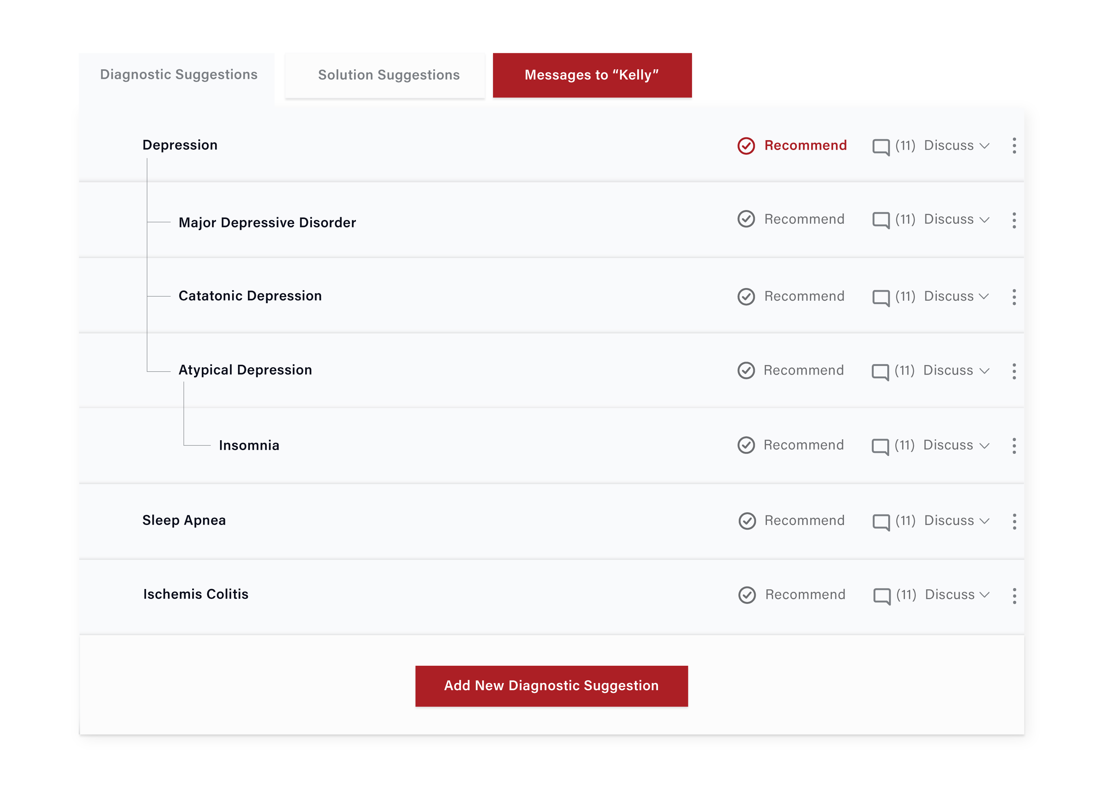
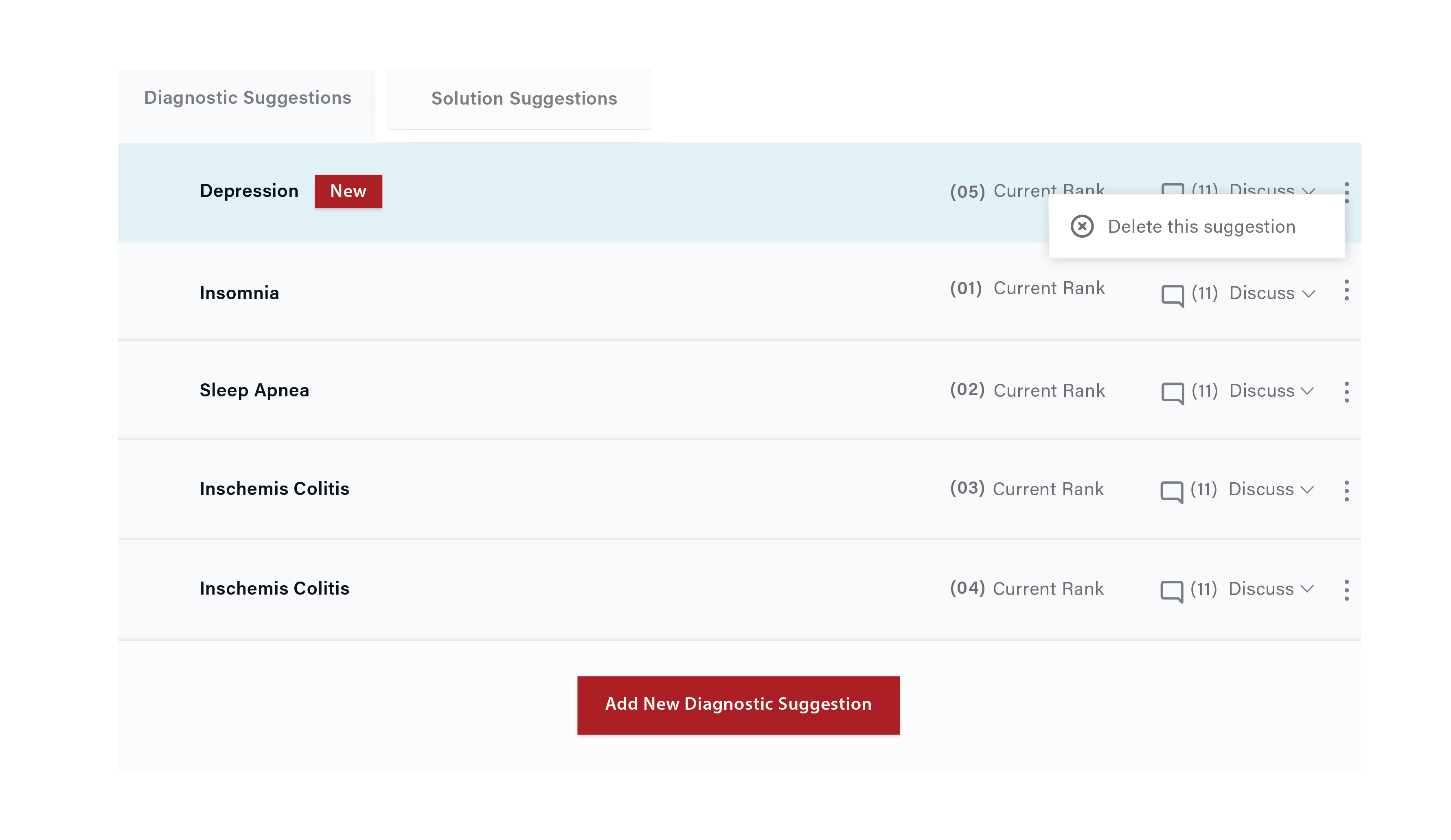
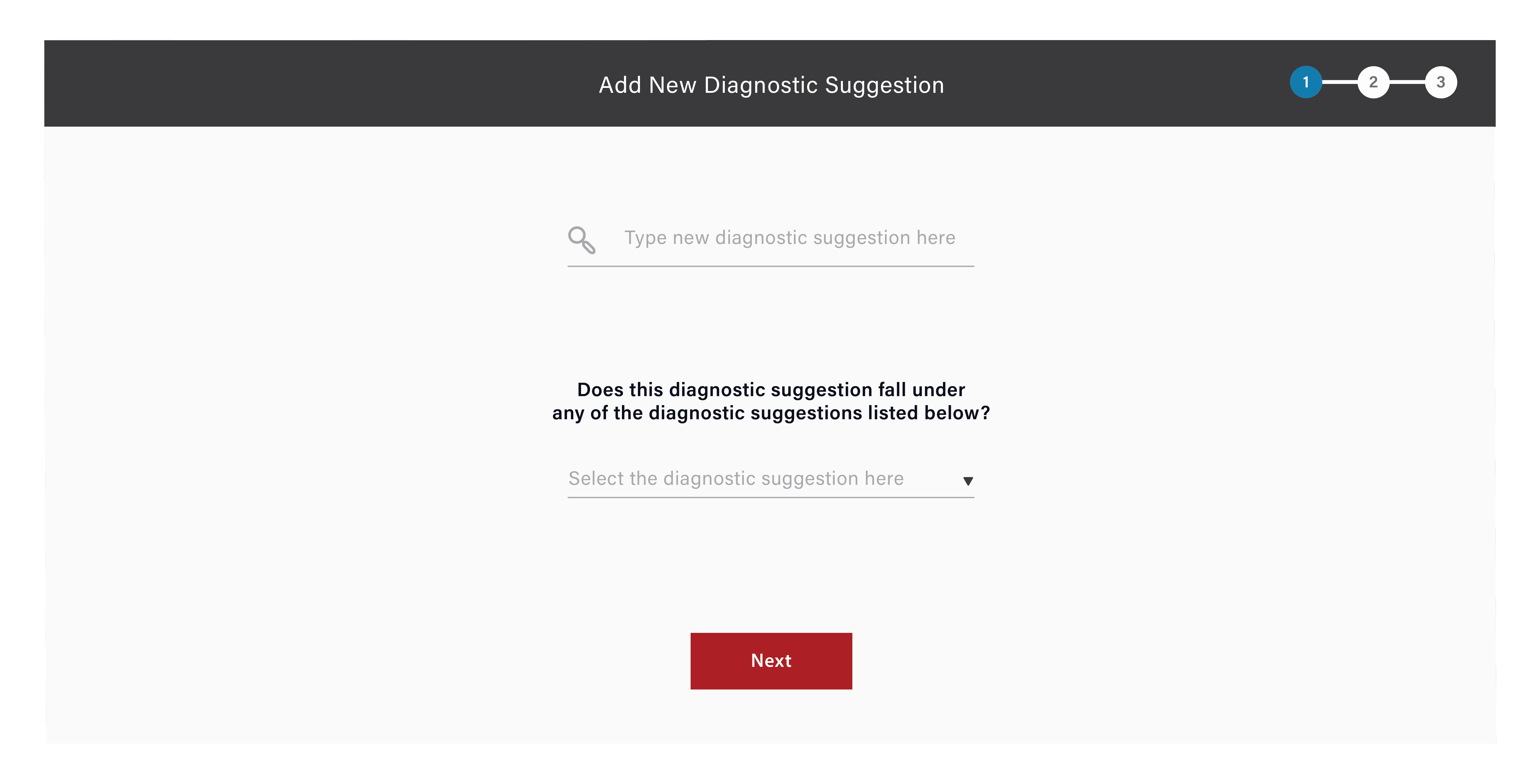
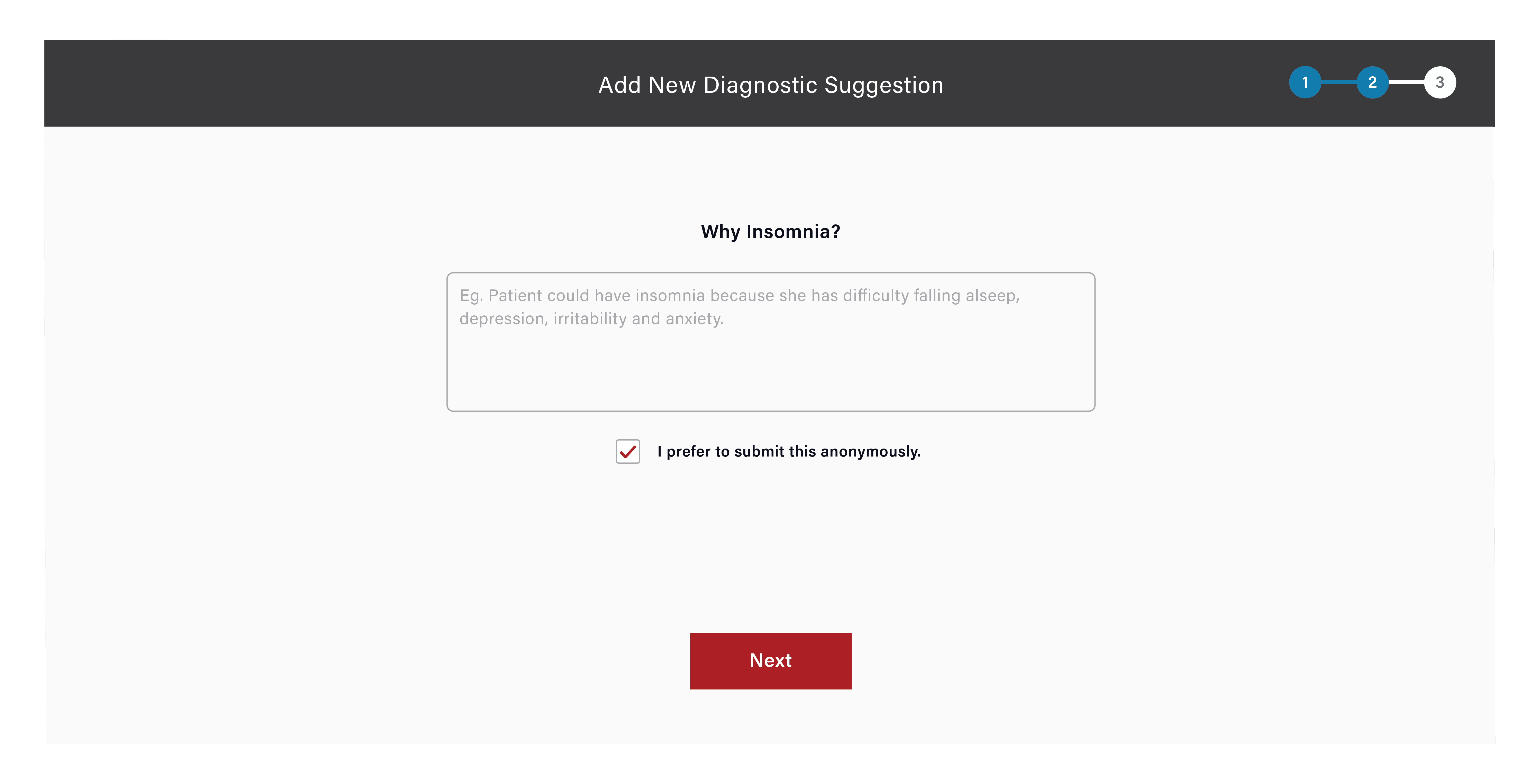
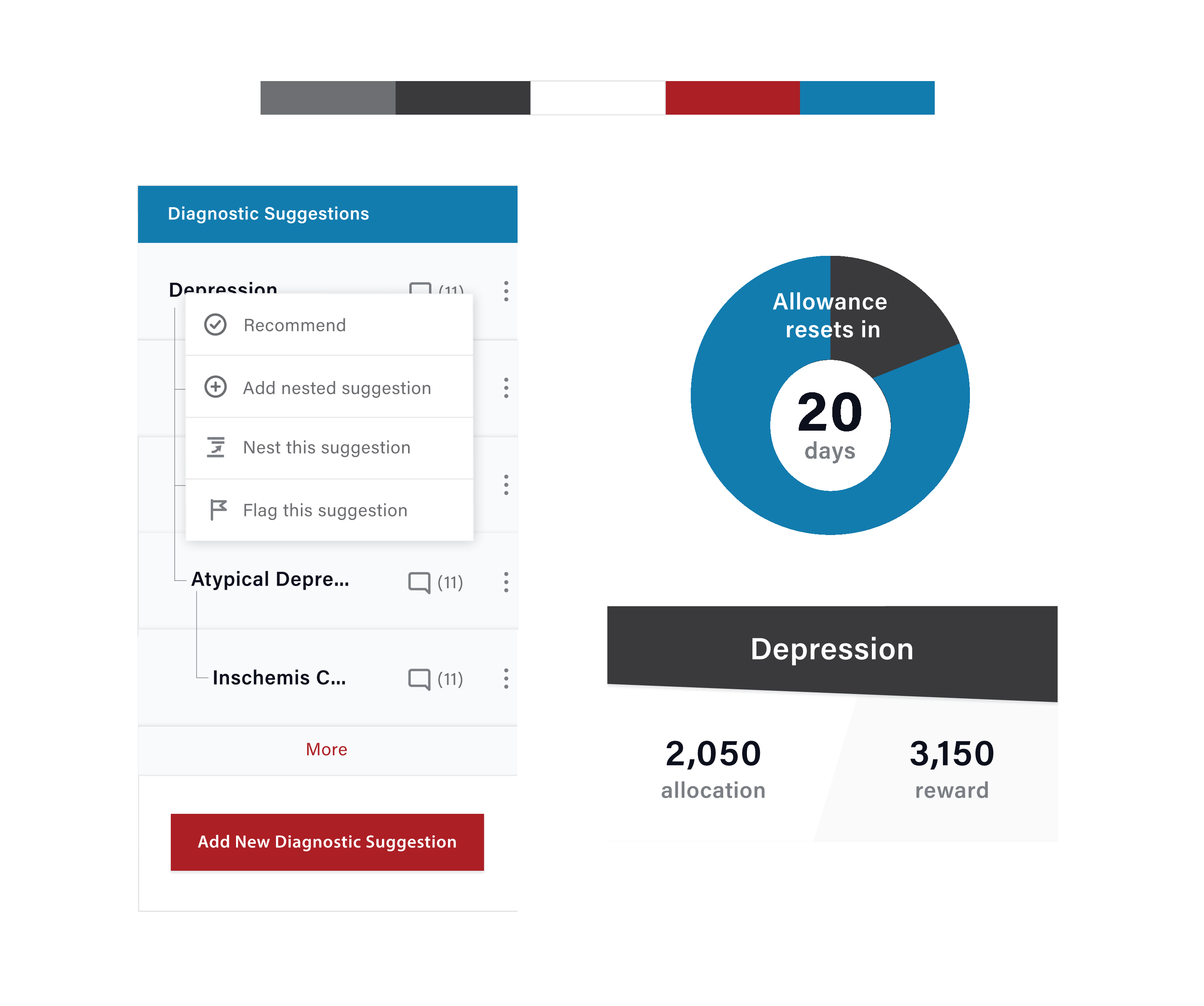
Sometimes a specific disease under a spectrum and the spectrum are added as seperate suggestions. To avoid this, I introduced nesting in suggestions. In the new design, detectives can add/recommend a nested diagnosis as shown below.
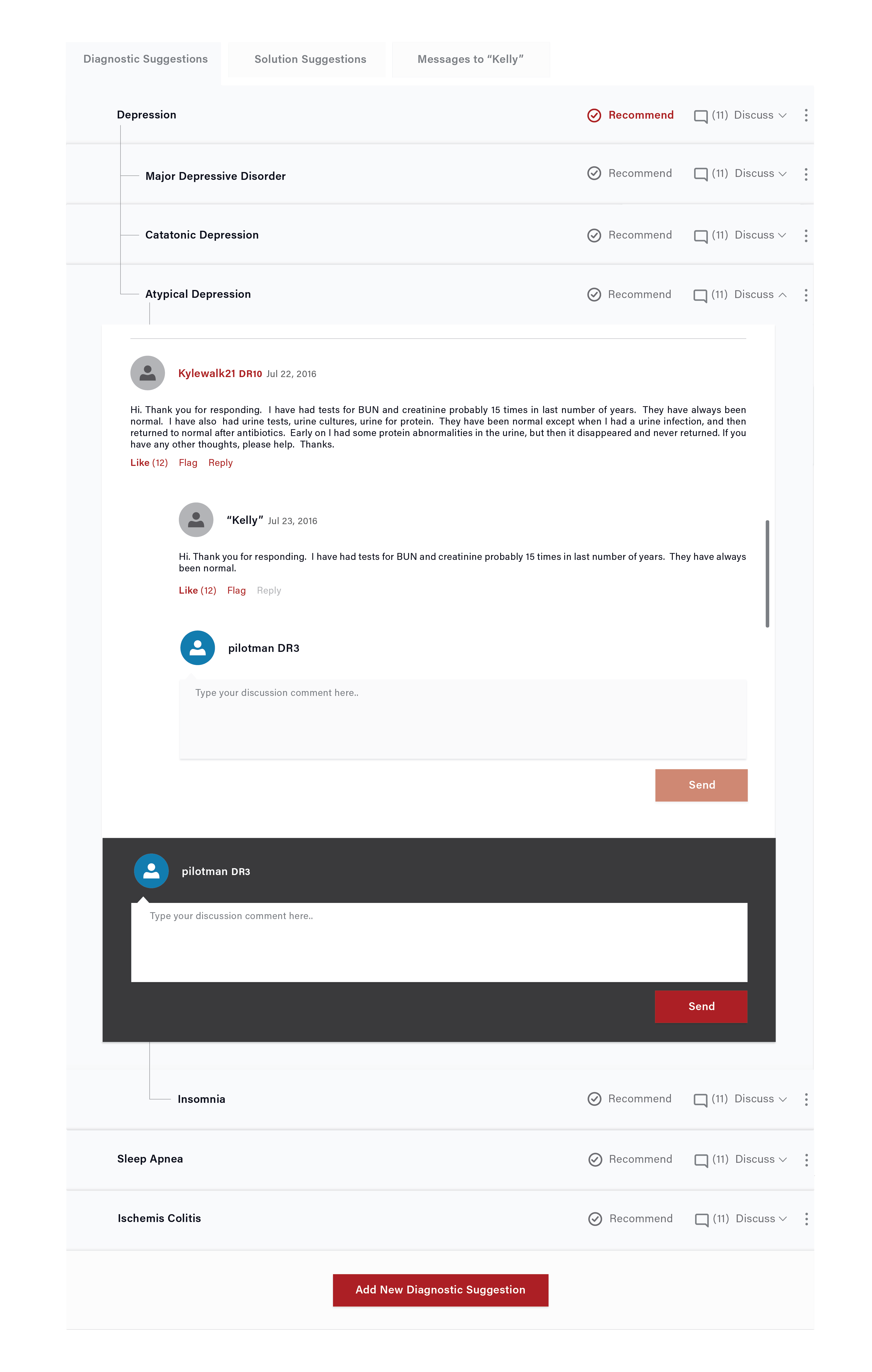
The most important change is: displaying discussions under suggestion rather than showing under a seprate tab as shown below.
Also, tweaked display card with the list of suggestions on the patient side to match up with new design for case page.
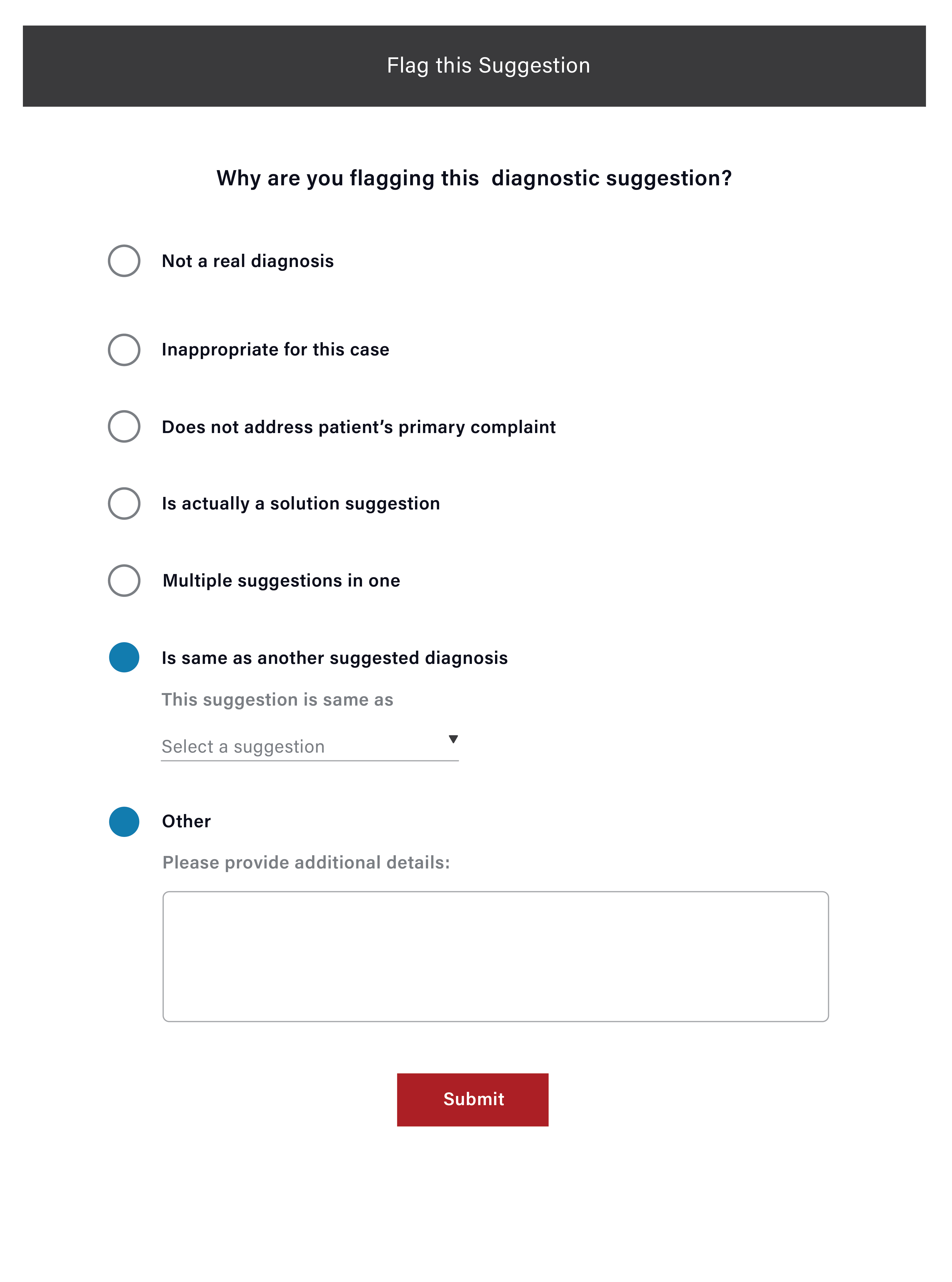
Adding/Recommending/Flagging Suggestion:
Due to limited resources, CrowdMed was mainly focusing on developing web platform. I saw equal traffic coming from mobile and web on Google analytics and introduced mobile first approach.
Here is the mobile version of the new case page design:
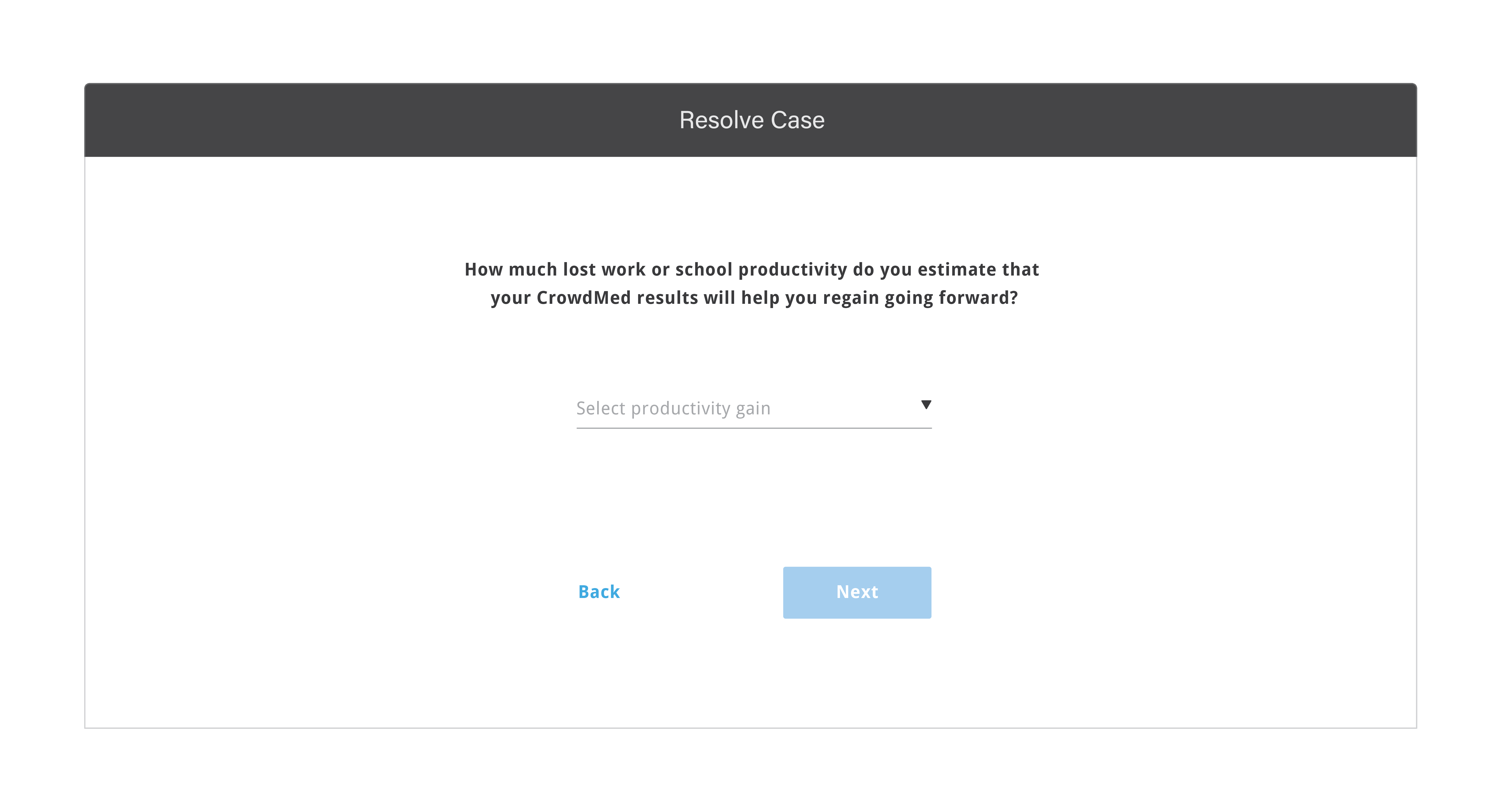
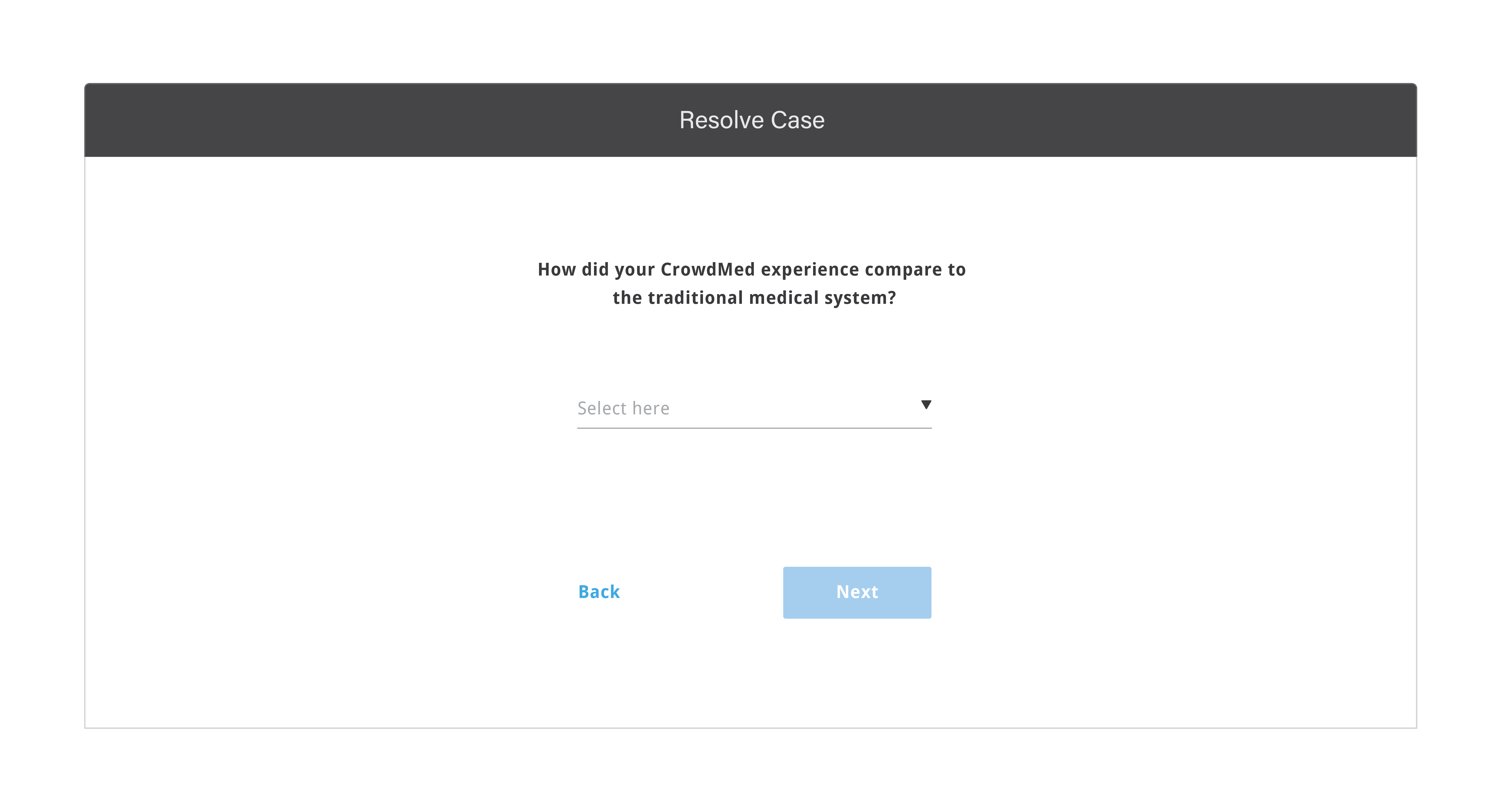
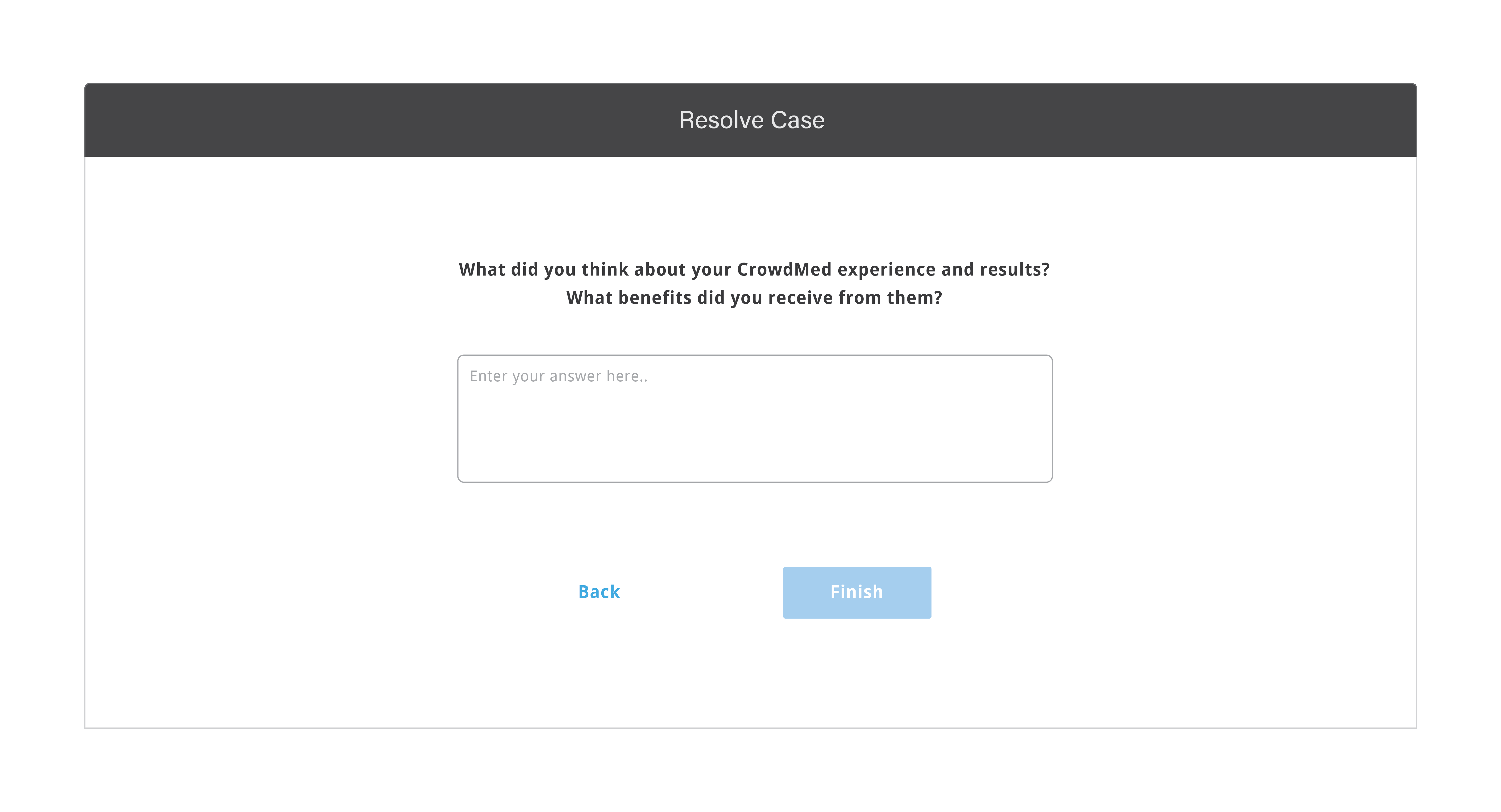
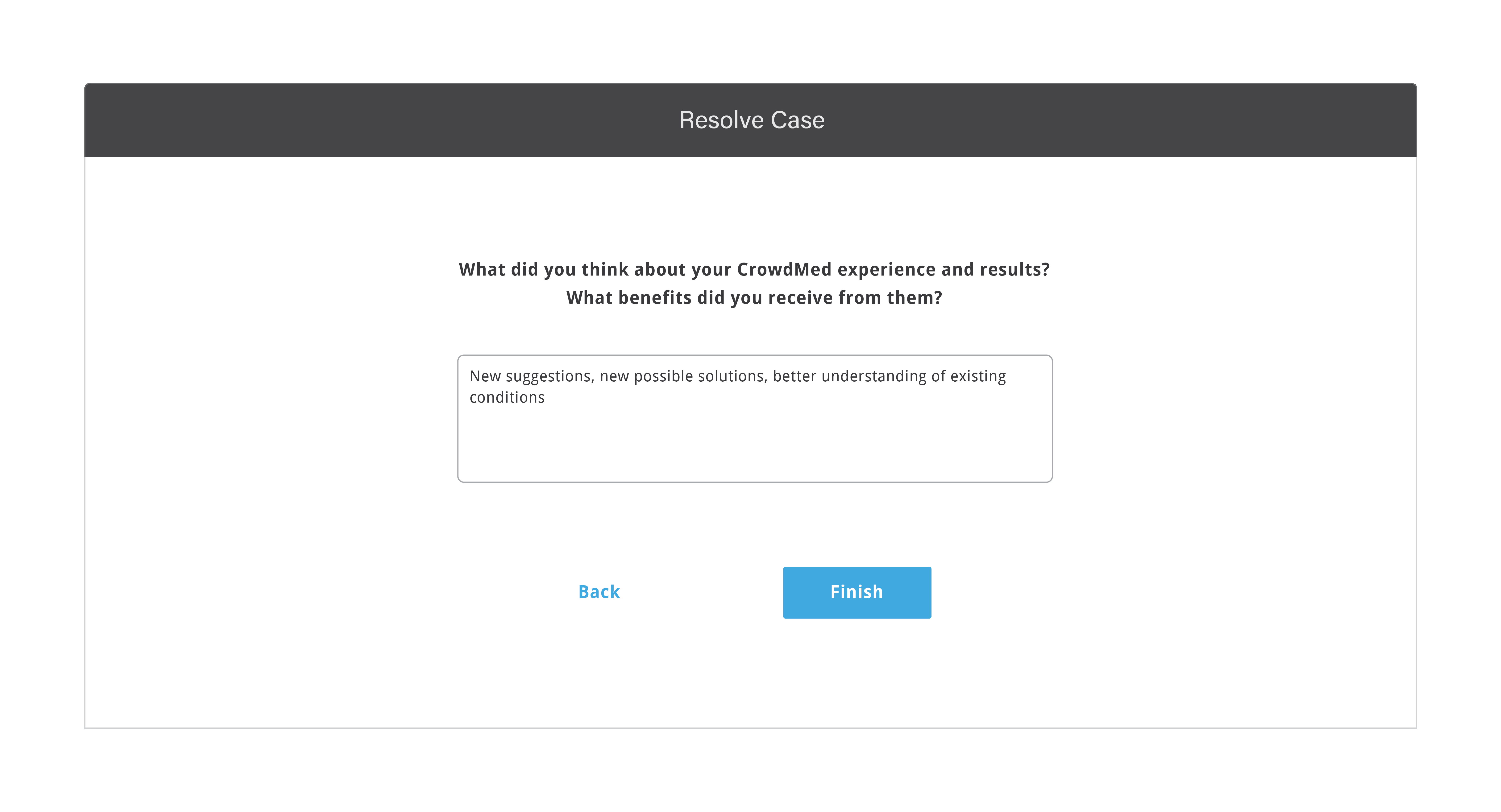
2. REDESIGNING CASE CLOSING PROCESS FOR PATIENTS(SHIFTING SUCCESS METRICS FOR THE PLATFORM)
This is a very important process for the platform as patients provide information about correct diagnosis and
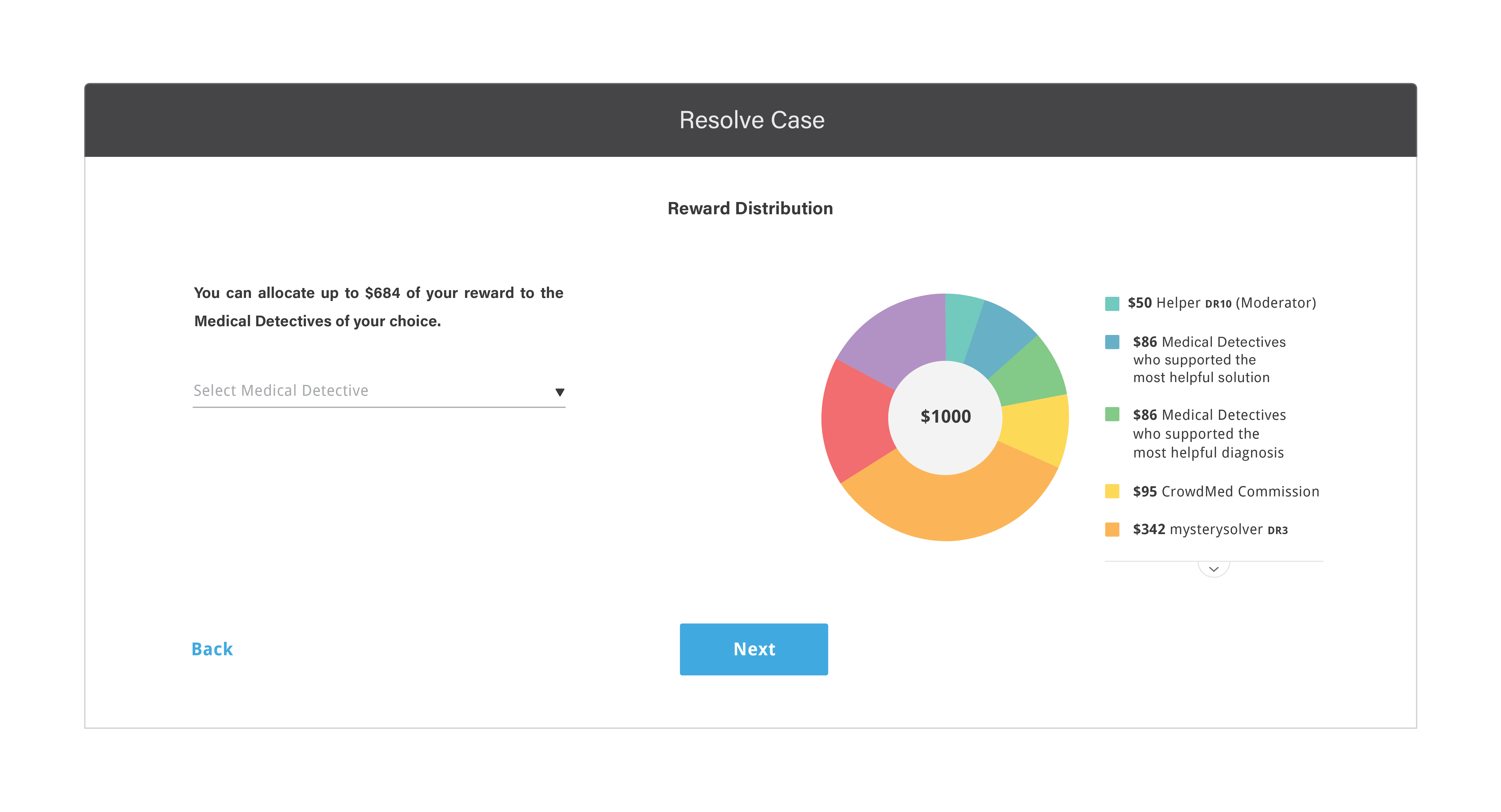
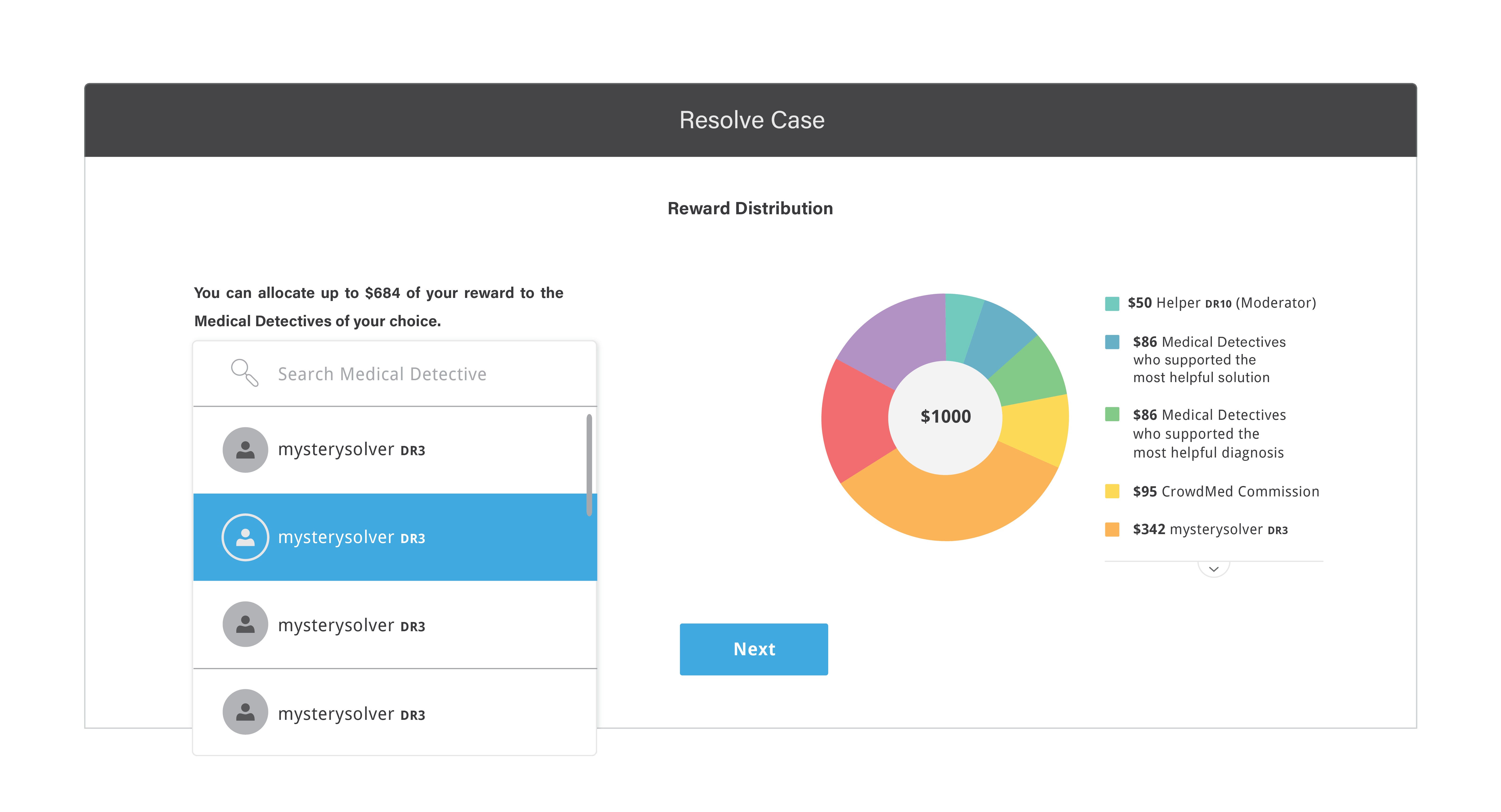
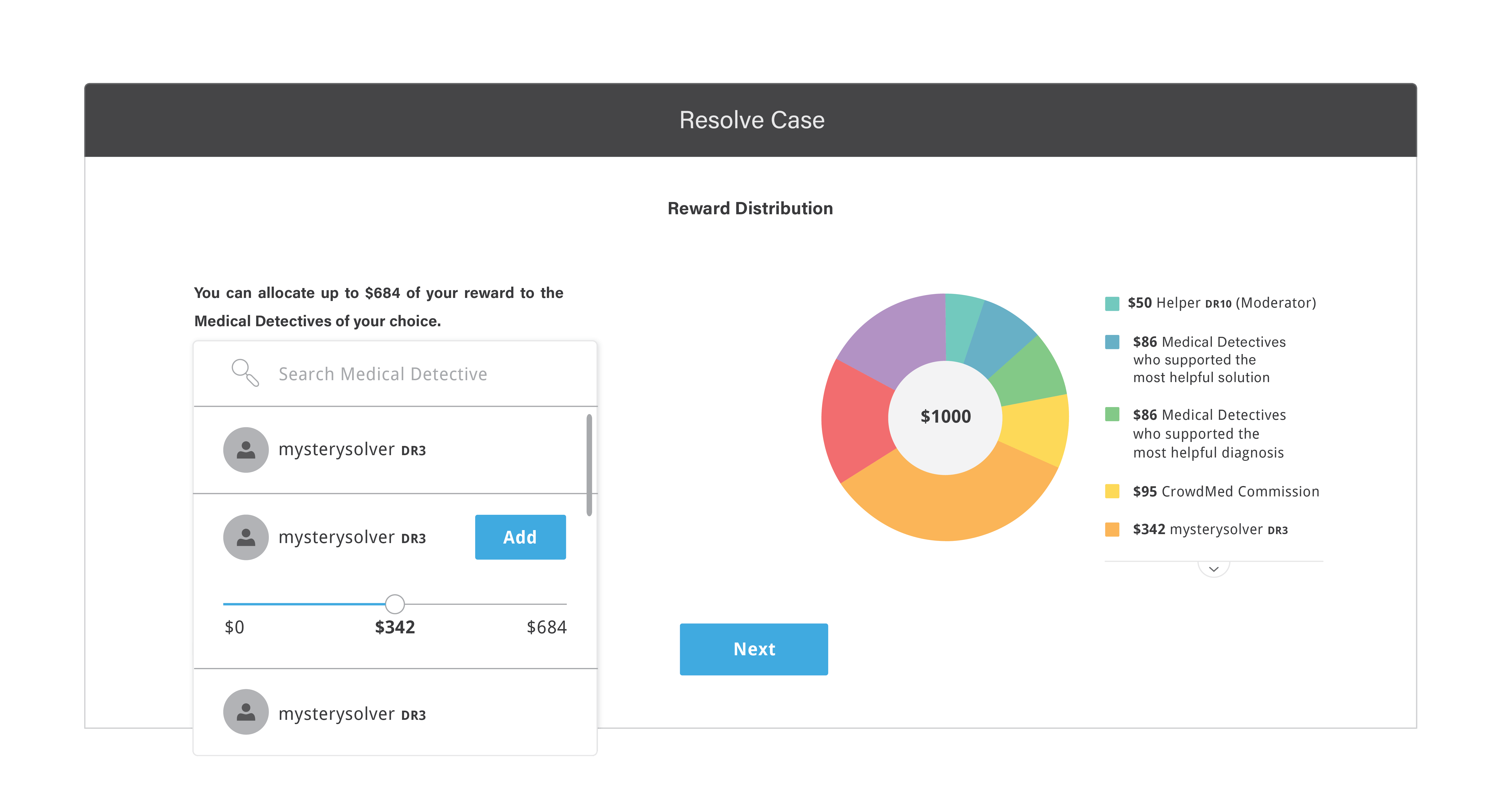
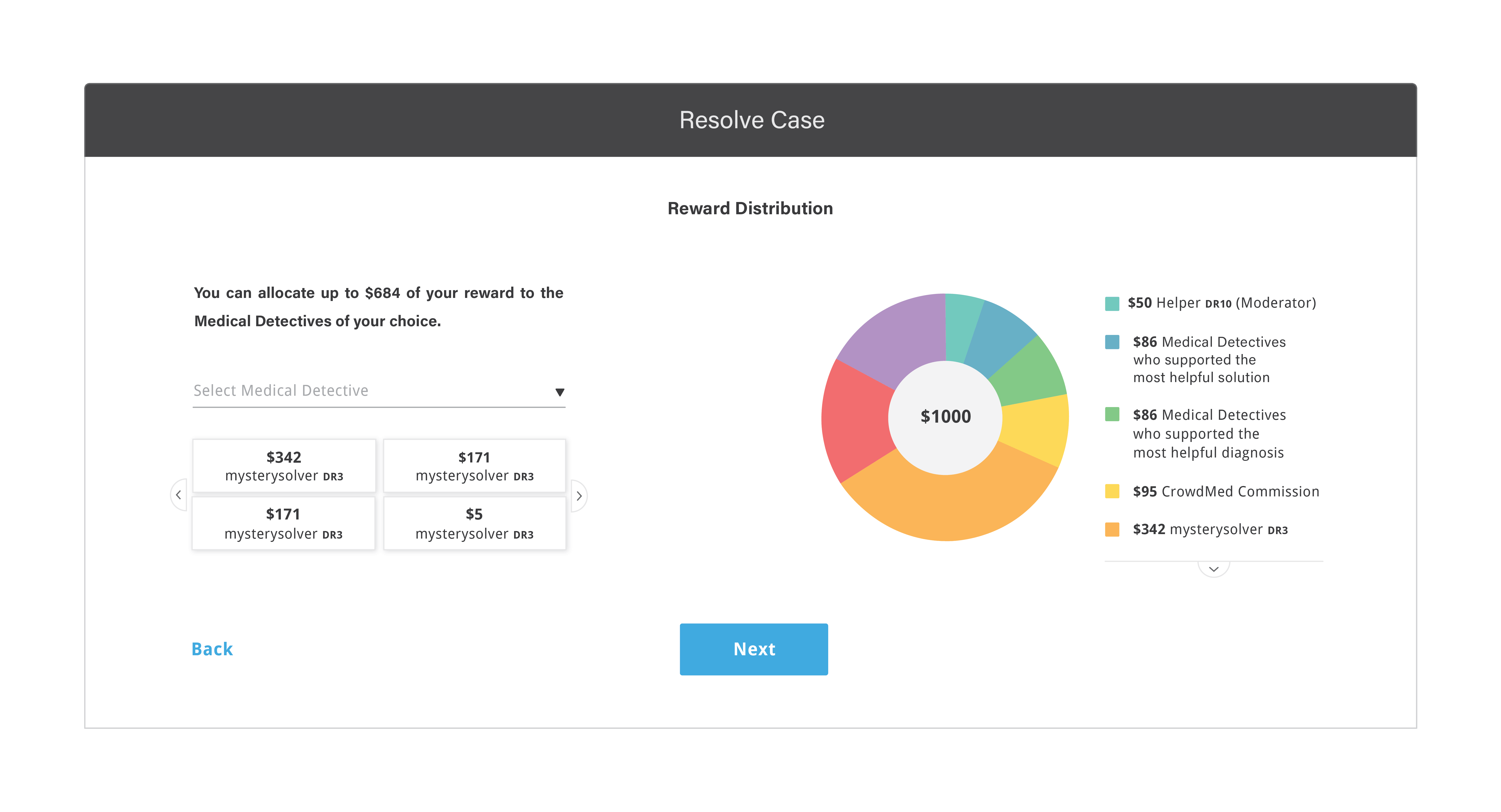
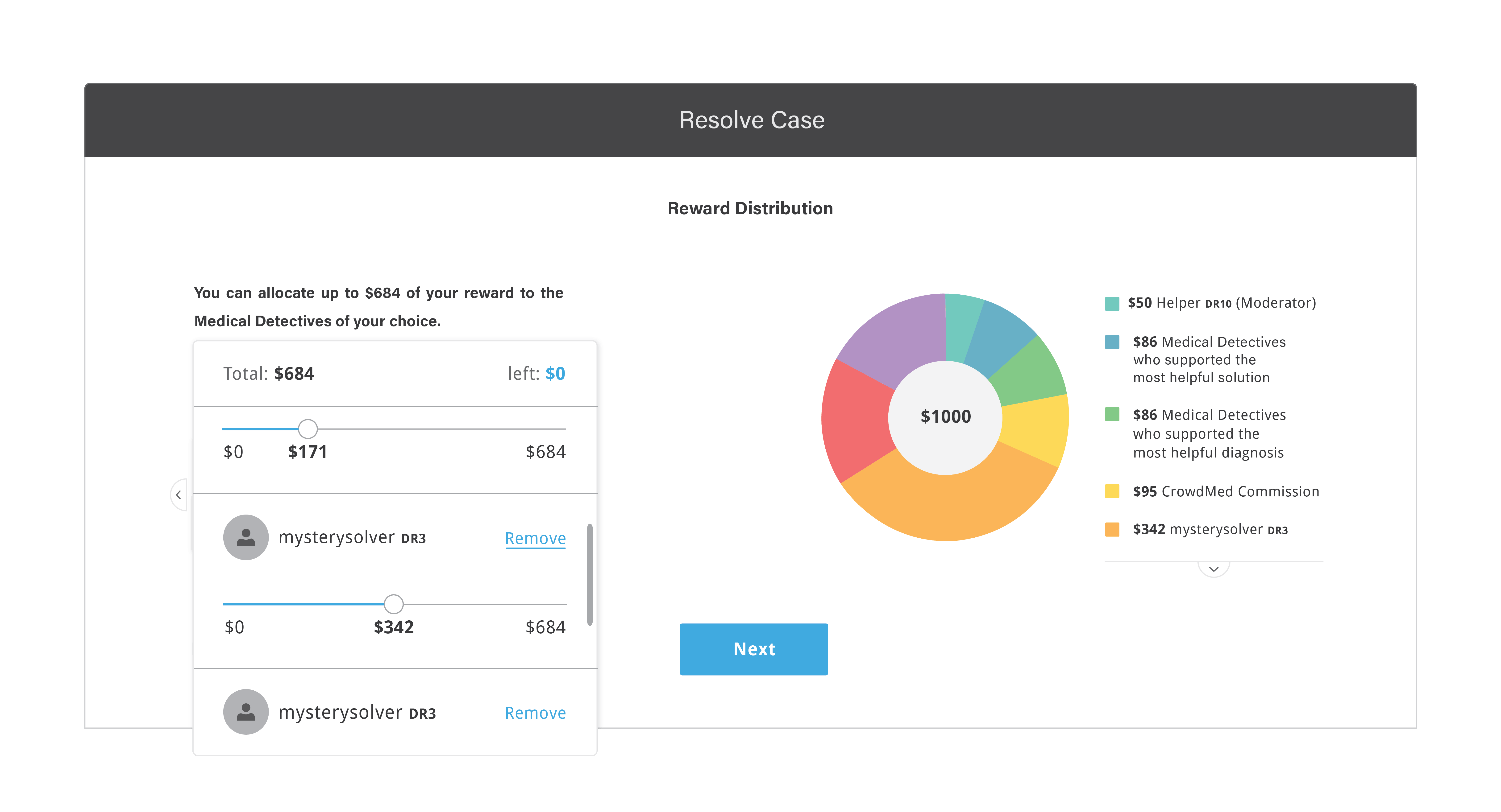
most helpful detectives which CrowdMed uses to distribute reward. I sketched out userflows for this process and some of the flows were missing in the design. Also, CrowdMed was not showing how the reward is being distributed clearly to patients.
This led to dissatisfaction/confusion in the patients especially the ones who did not get helpful suggestions on the platform.
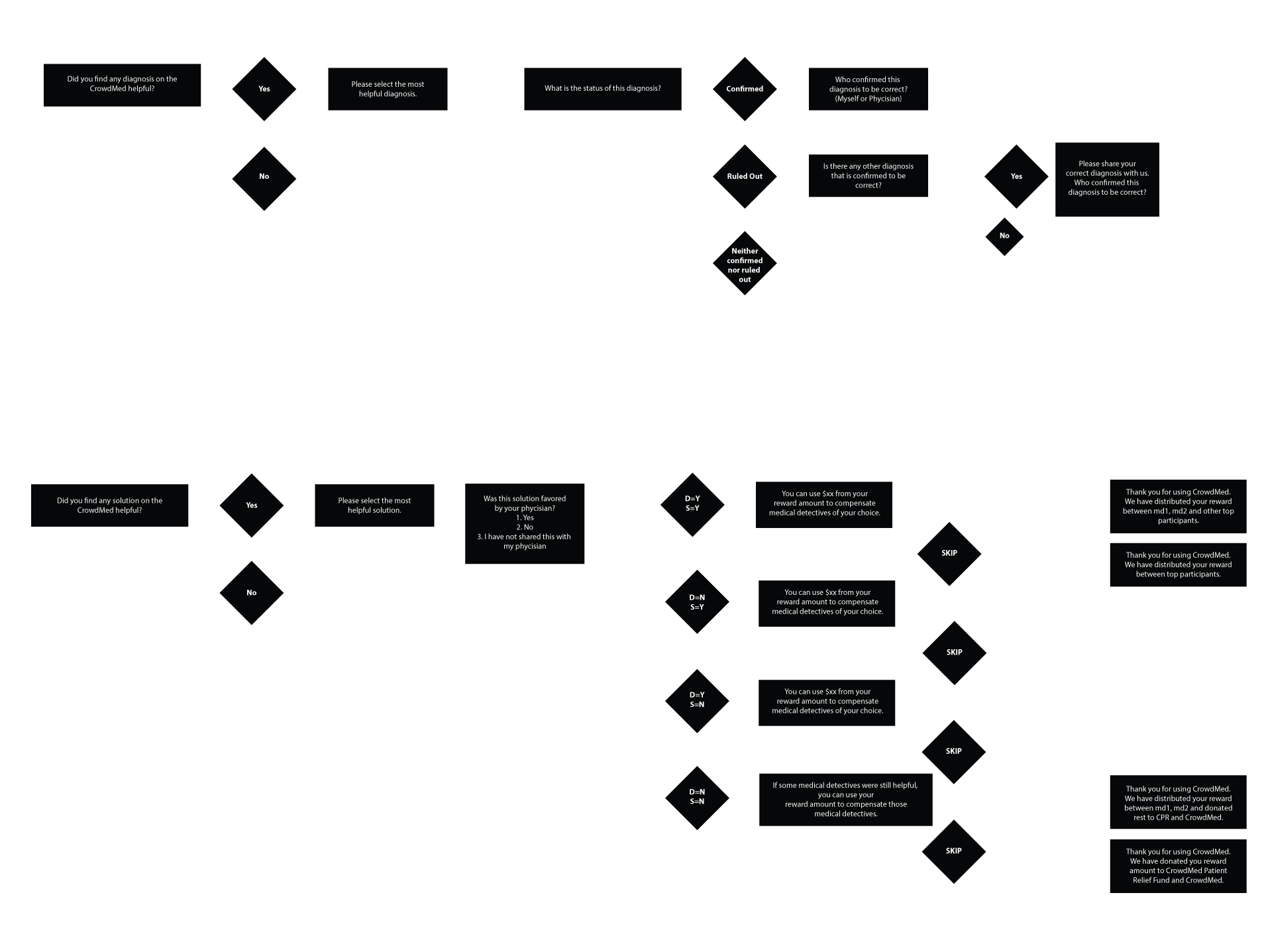
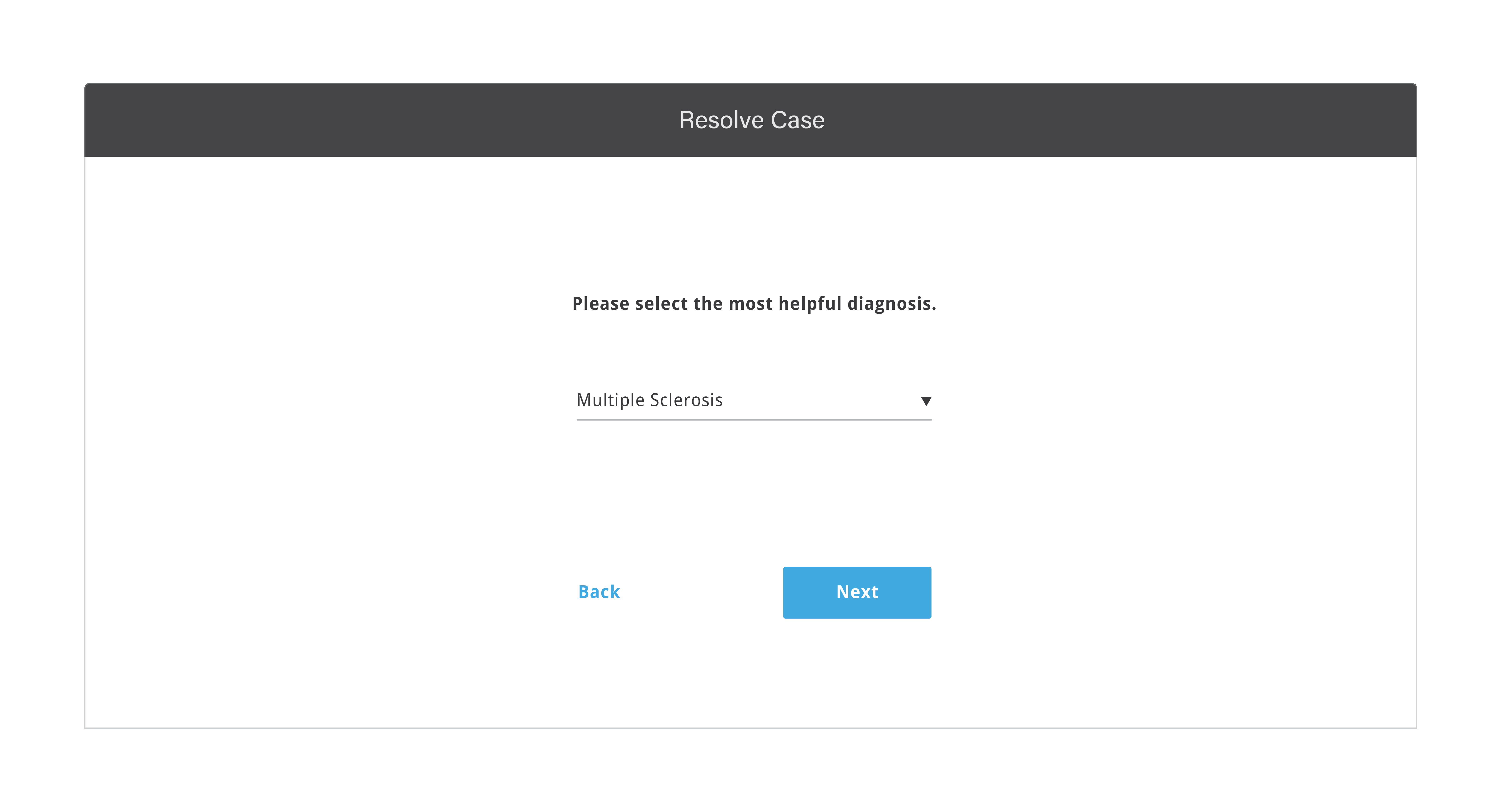
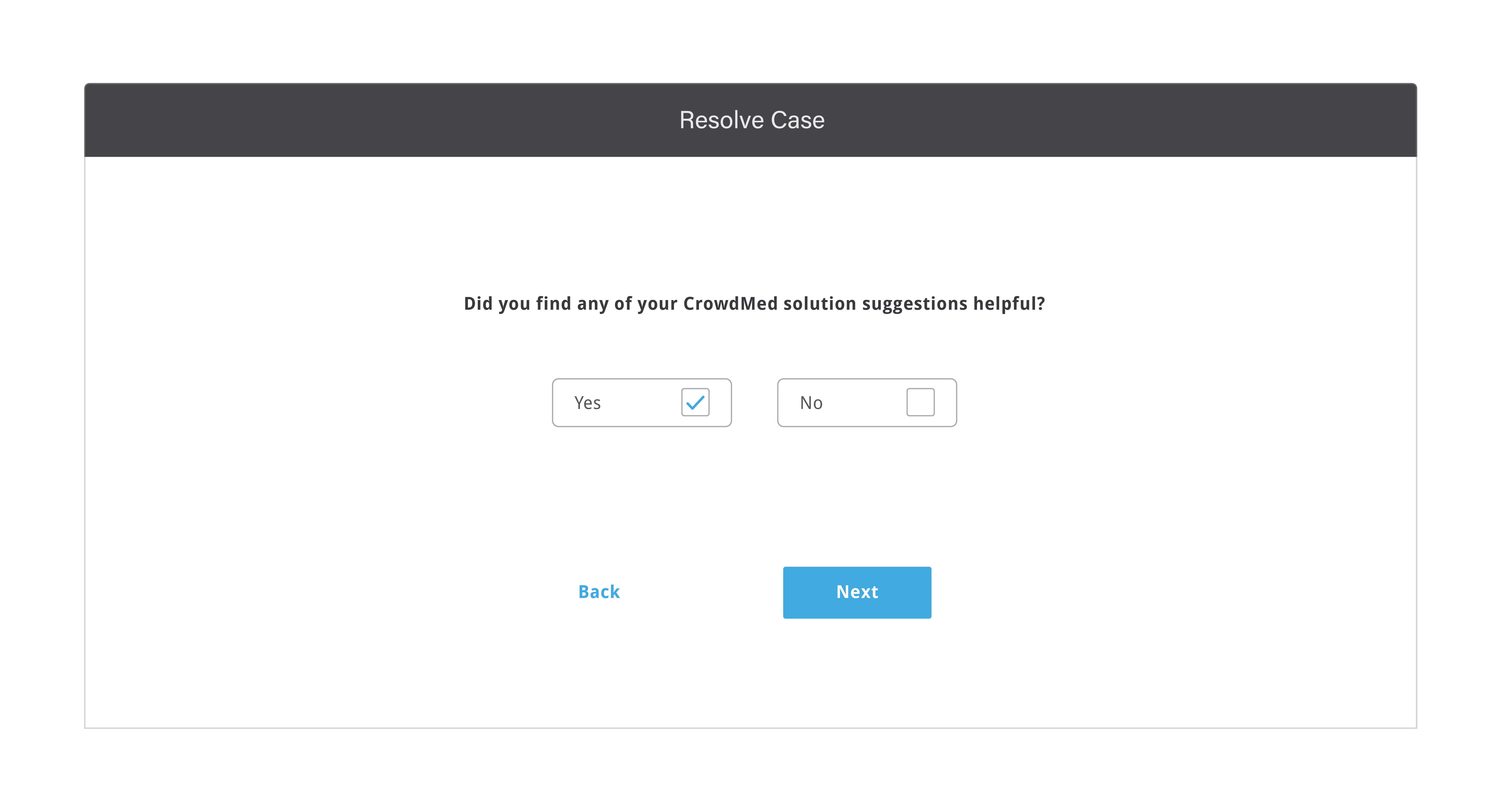
Shifting success metrics by rewarding most helpful diagnosis instead of correct diagnosis:
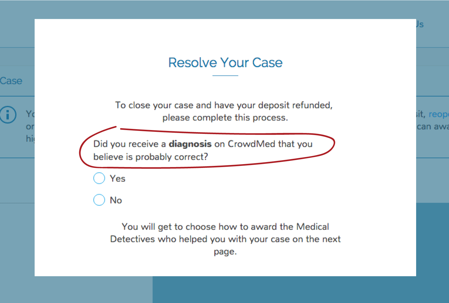
CrowdMed used to ask if patient received "probabily correct diagnosis" on the CrowdMed. When patient received correct diagnosis, it rewarded
medical experts/detectives who participated in posting and recommending the correct diagnosis. This fuctionality did not allow to reward
medical detectives who posted or recommended on helpful diagnoses on the case which did get the correct diagnosis.
New Design:
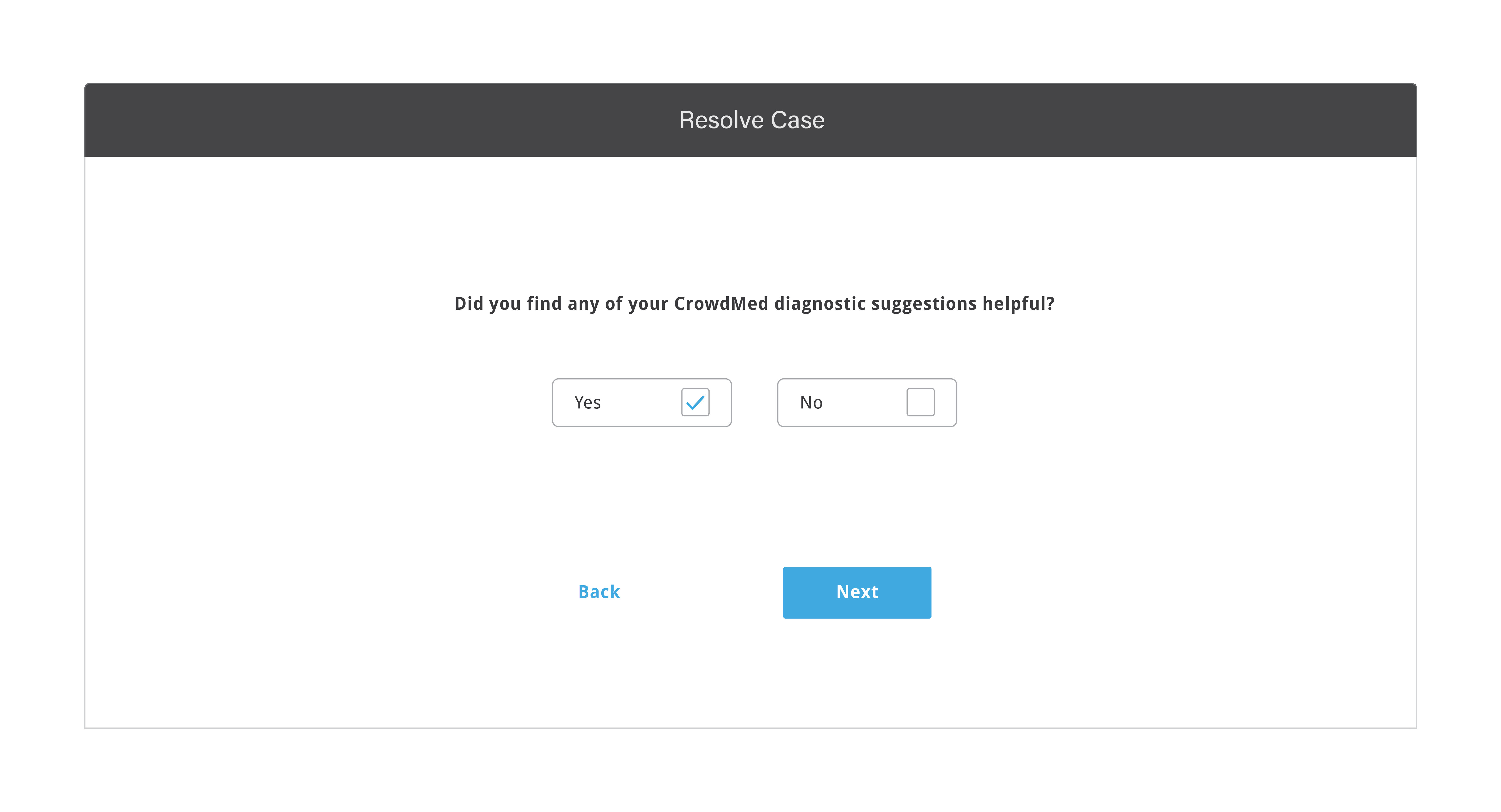
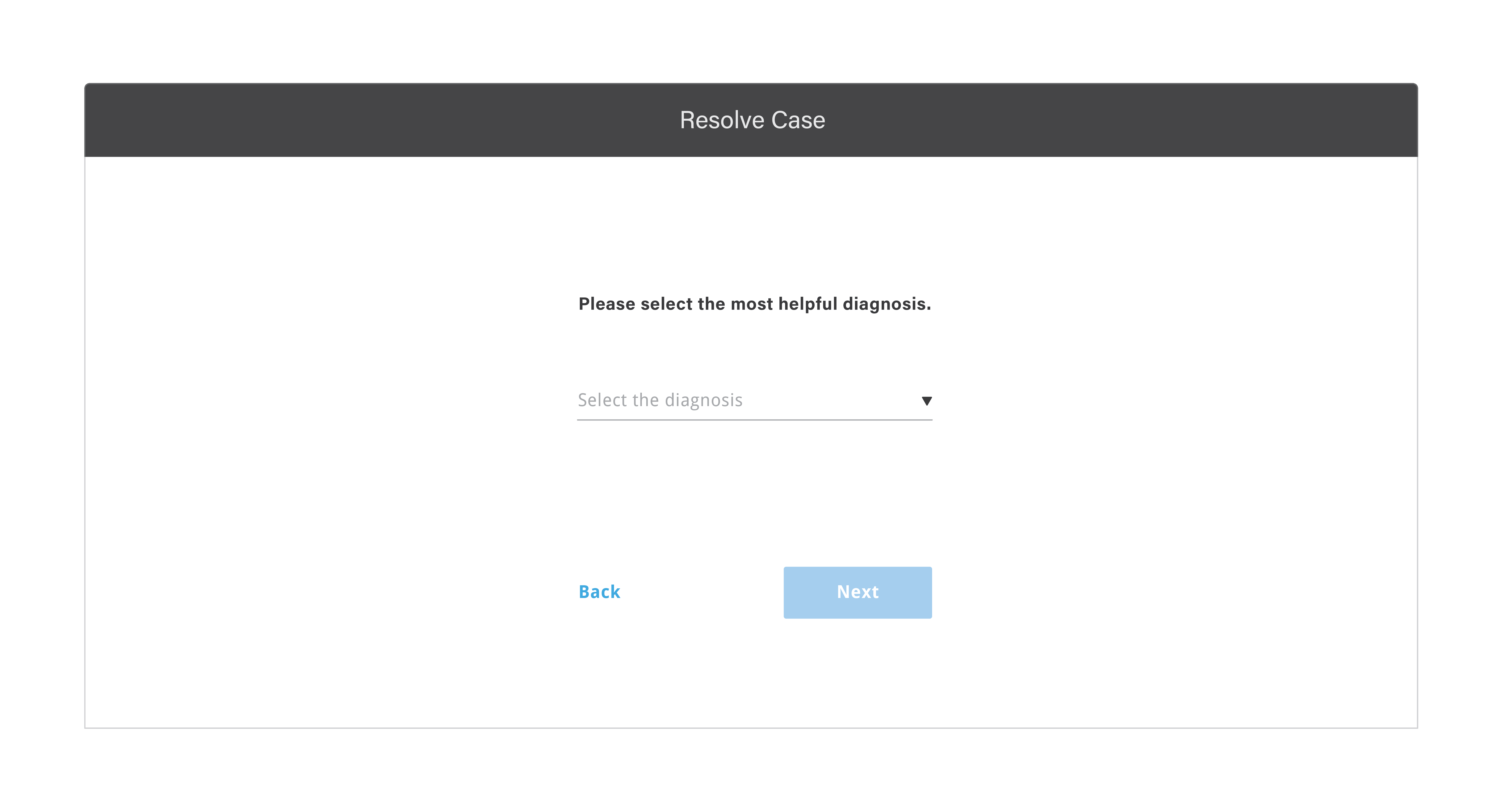
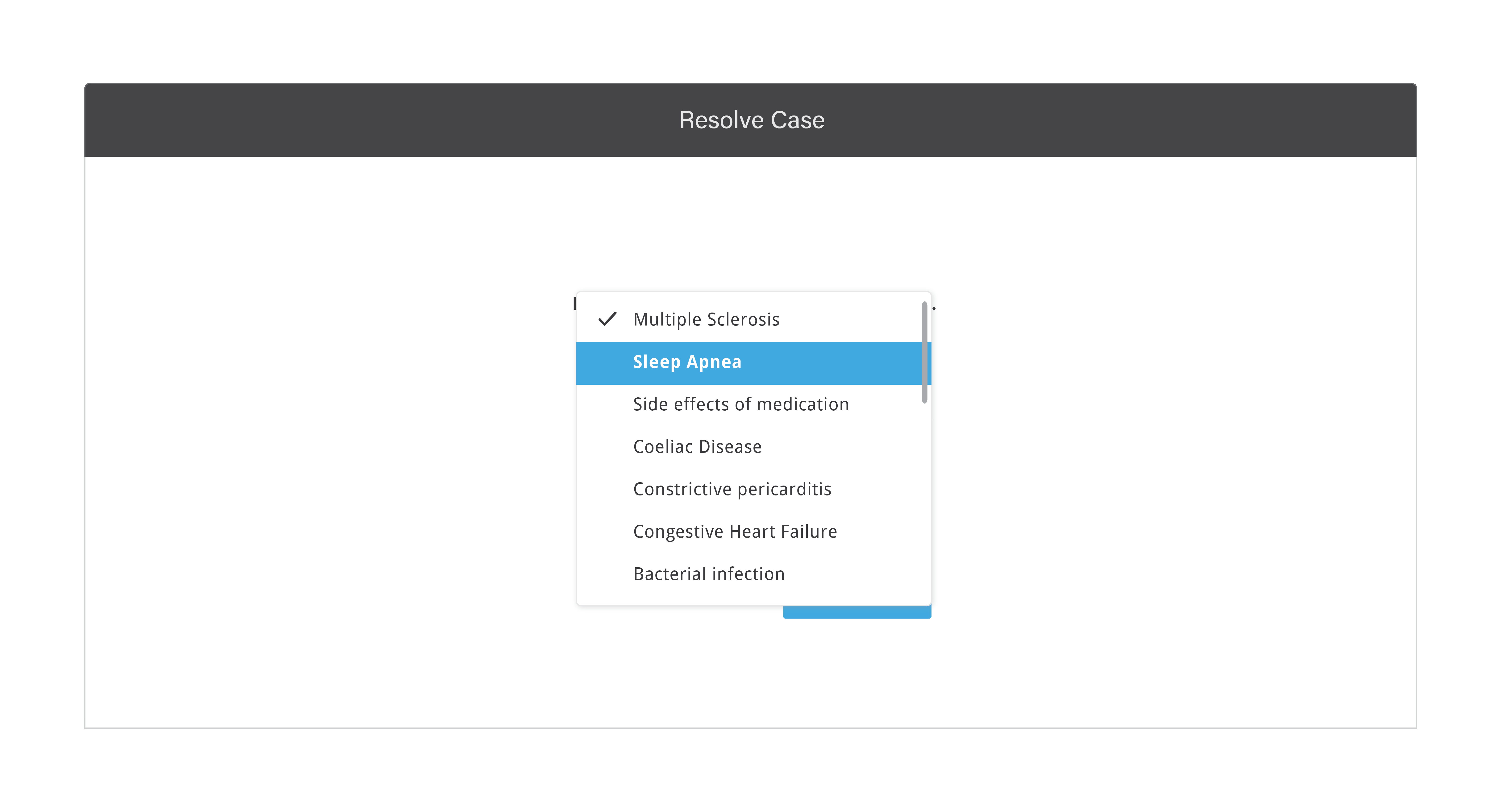
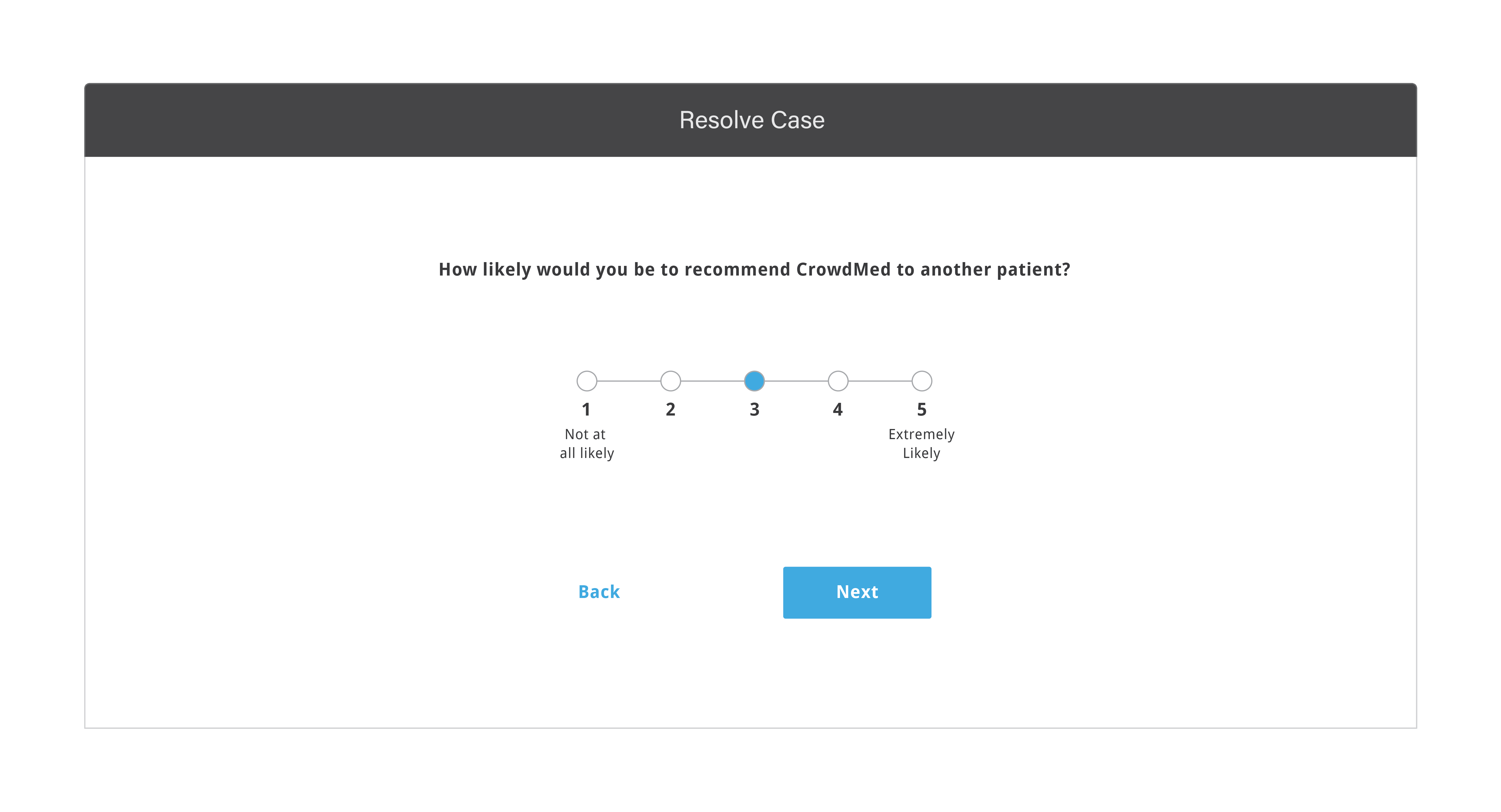
Now CrowdMed asks for the most helpful diagnosis and rewards medical detectives who participated in it. I had also sketched out solution to reward multiple helpful diagnoses, but we decided to implement it later. Here is the new design for case solving process:
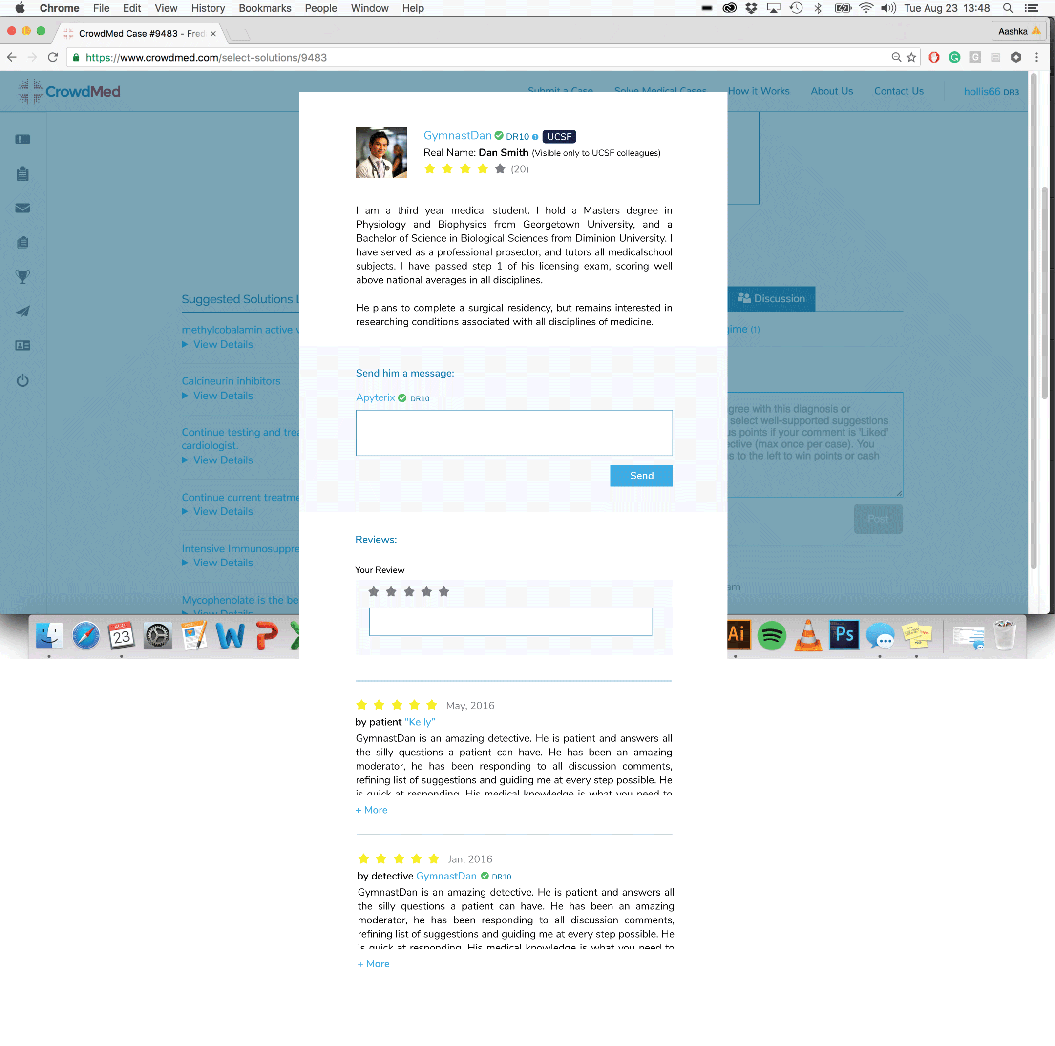
3. REDESIGNING MEDICAL DETECTIVE BIO PAGE WITH REVIEWS AND MESSAGING FEATURE
From user research, I found out that medical detectives used to chat with each other
through review feature. Crowdmed did not allow two medical detectives to have private conversation to maintain transparency on the platform. This made it really hard for medical detectives to take help from each other and learn how
crowdmed functions and medical detectives started using review feature to chat. I re-designed medical detective bio page with messaging features along with review as shown below to provide them a seperate channel for private conversations.
Visual Design and Rebranding Strategy
As CrowdMed was growing at a fast pace, its visual design and branding is not updated in a long time. While working on a new development cycle,
I also started improving overall visual language of the website. This includes fonts, colors, icons and UI language.
PRIMARY COLOR PALETTE
Kept the primary color palette almost the same,except got rid of an unnecesarry shade of blue. I decided to perfect the functionality in the current
development cycle and take care of branding in the next.
ICONOGRAPHY
Created simple, cute and harmonious handmade icons! I love making cute icons. :)
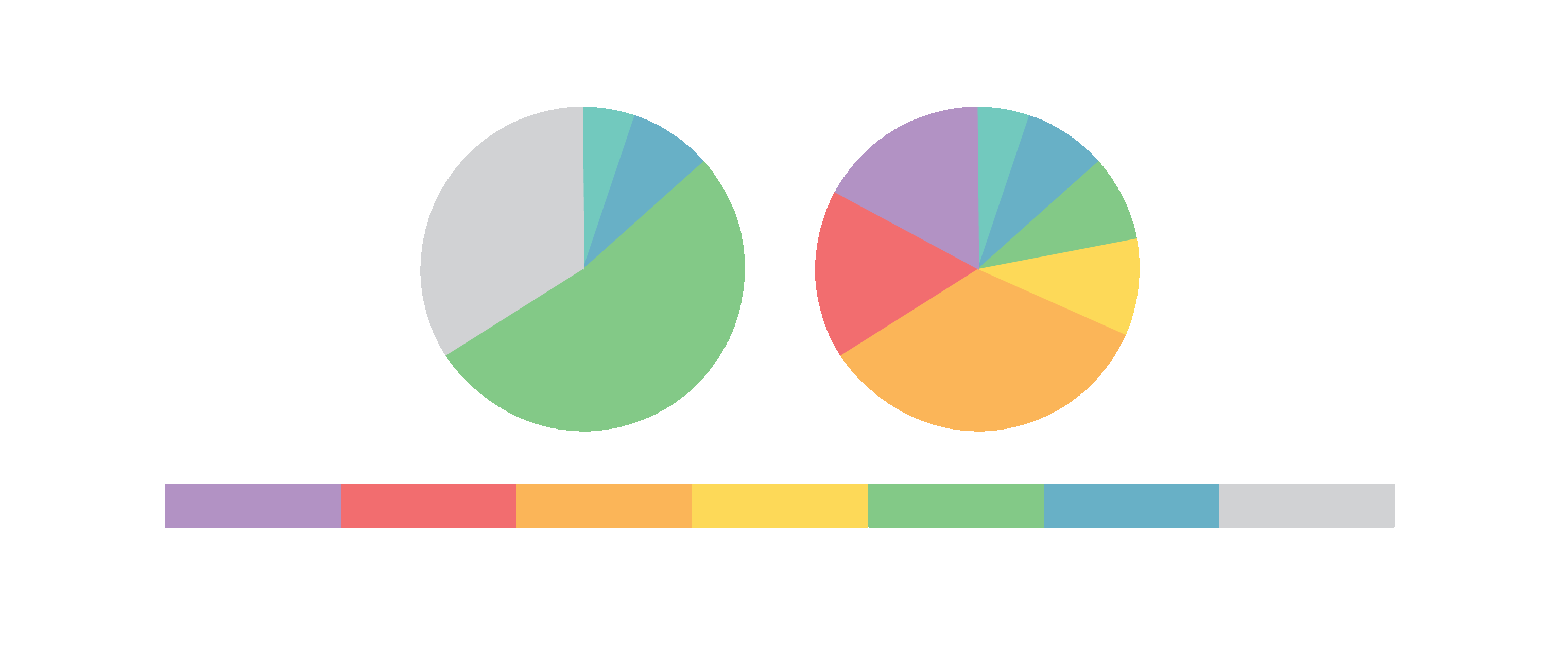
EXTENDED COLOR PALETTE
CrowdMed is a data heavy platform. At many places it vizualizes data in form of charts. I created more vibrant secondary color palette
matching with the primary. I was inspired from Mint's design. Mint has fabulous design for charts.
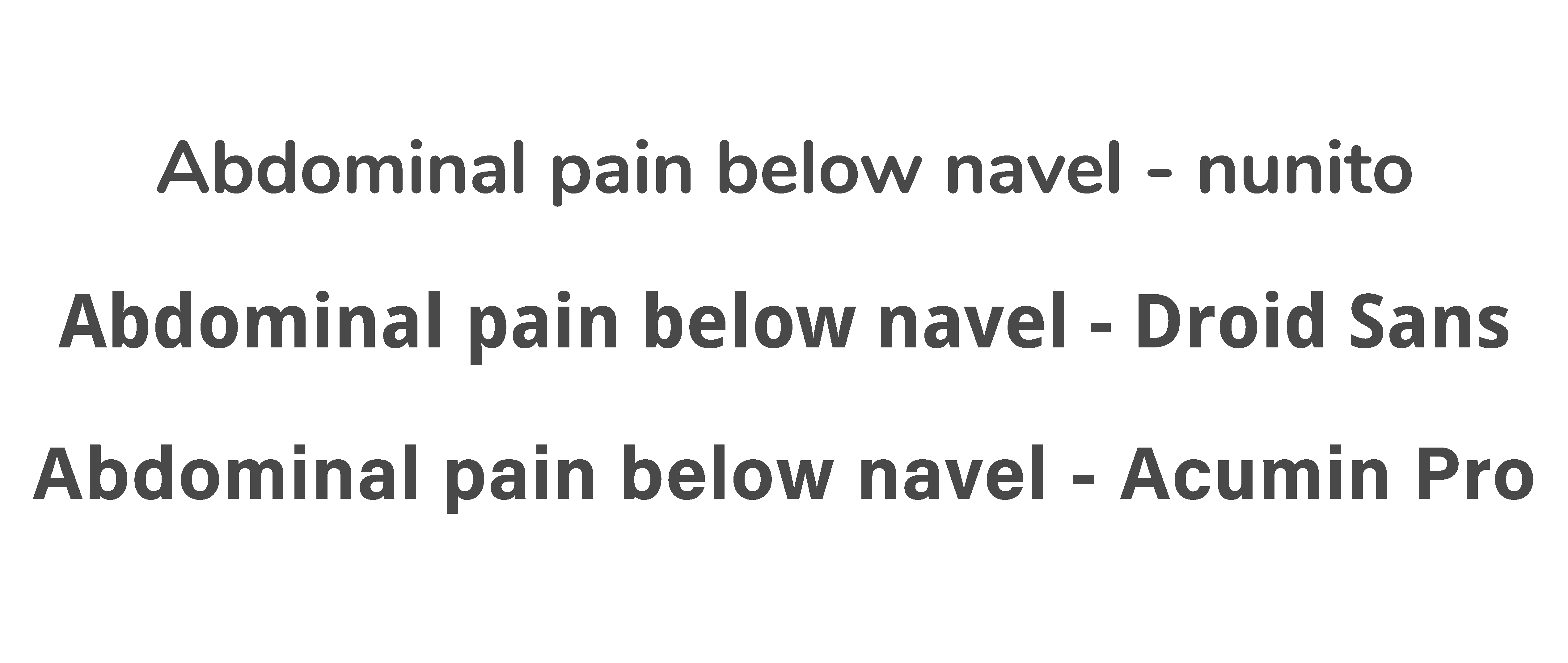
FONTS
CrowdMed is using nunito. The font and and its current usage is clunky. First, I tried using droid sans which are free in my new designs but
they were not perfect. Then, I moved to Acumin pro offered for free by Typekit over one website.
BRAINSTORMING ON REBRANDING
CrowdMed's current shade of blue and red are dirty and are old fashioned.
While redesigning, I started experimenting with more contemporary and fresh colors.
EASILY REBRANDABLE INTERFACE DESIGN
I decided to design the interface so modular that it can adopt rebranding
in the future without any tweaks.
